‘Mark Strizic’, National Library of Australia Magazine, 2013
Mark Strizic, who died in December last year, was the last of his generation. He was the last of an important group of European émigré photographers, which also included Wolfgang Sievers and Henry Talbot, who immeasurably enriched Australian photography. These photographers were, in their turn, part of a larger group of émigré artists, craftspeople, designers and architects who immeasurably enriched Australia as a whole. But Strizic was a bit different. After arriving in Melbourne from Zagreb in 1950, and taking up photography in the mid fifties, Strizic’s subsequent fifty-year career was much more complex, diverse and manifold than any of the other émigré photographers. He not only worked in many different photographic styles, but he was also interested in new and experimental photographic techniques, as well as book design and production, architectural murals and tertiary teaching.
Artistic collaboration was fundamental to Strizic’s career, and the two major groups of his photographs in the National Library of Australia come from collaborative projects. In 1960 Strizic worked with the architectural critic, historian and lecturer David Saunders on producing a picture book about Melbourne. Although modestly scaled, the book, Melbourne: A Portrait, is still a charming object even today. Unusually for a book of the period the entire publication is printed using the new offset printing process, rather than the photographs being printed from plates separately engraved to the letterpress text. However Strizic’s softly sunlit, cleanly composed, almost Pictorialist photographs translated well to the pages via offset. As the book’s designer, Strizic was able to freely move the rectangular photographs up and down or across the square pages so that the composition of one visually interlocked with the composition of the next, while expansive fields of blank paper, which sometimes also included floating lines of text, brought each consecutive double-page spread together into a different graphic composition visually relating to the subject matter of the photographs.
Although modestly scaled, and priced, the book didn’t lack ambition, Saunders’ text was repeated in Italian and German, envisaging a global market for images of cosmopolitan Melbourne. Strizic himself acknowledged that the inspiration for the book came from a book called Light and Shade. which his father, an architect, had published on his home town of Zagreb in 1955. It was clearly to this more contemplative, ambling, European style of the ‘city book’ that Strizic aspired, rather than the strident, commercial boosterism of other Australian photo books of the time, although both kinds of book cast Melbourne in a very positive light. The Book of The Year award which Melbourne: A Portrait won in 1961 duly recognised the integrated design of the complete book package, including a bright and chirpy cover design by Leonard French, that the offset printing, carried out by Adelaide’s Griffin Press, Australia’s premier printer of the period, had allowed.
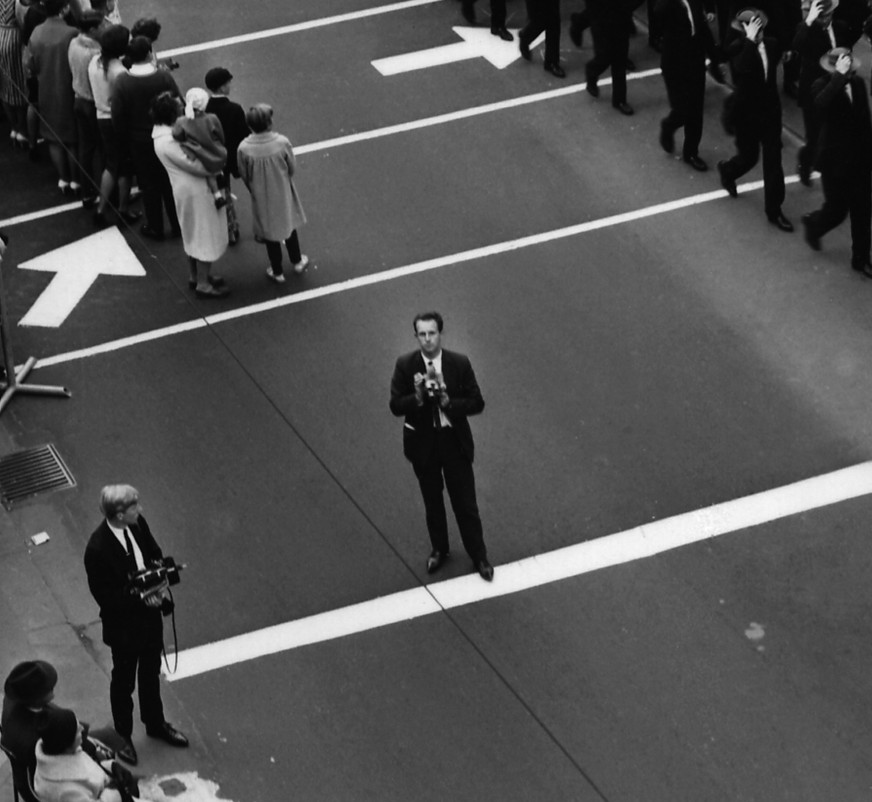
An architecturally transforming Melbourne continued as one of Strizic’s main themes for the next two decades, and he developed a distinctive style, often shooting straight into the light to produce extreme contrast, with blown-out highlights silhouetting black shadows. The old is often juxtaposed with the new, and hot gritty sunlight often shears across cliff-like facades. The people of Melbourne, caught in a headlong rush hour or in exhausted repose, also feature; but Strizic’s photographs were recording the radical expansion and verticalisation of Melbourne during this period, as skyscrapers pushed upwards and car-choked roads pushed outwards, so Melbournians are often left behind or pushed out of the way, squashed down at the bottom of his shots, or squeezed in by his constricting framing. By the late 1970s Strizic’s Melbourne had changed radically from his gentle1960s vision, it had become thoroughly dystopian, an inhuman place of ugly pavements and tangled wires. Using a process he called ‘photochrome’ he even began to print his black and white negatives on colour paper, as well as experimenting with duplicating them onto colour film with high-contrast lithographic film, electrifying Melbourne with intense, sometimes even psychedelic colours that gave his cityscapes a psychological, even hallucinatory, edge.
In 1967 and 1968 Strizic worked on two other important projects with Sun Books, a start-up publishing company which was experimenting with different ways of taking advantage of the boom in paperback publishing that was bringing book prices down and increasing the popular market for a diverse range of formats and subjects. For one project Strizic worked as a stills photographer on Tim Burstall’s pioneering film 2000 Weeks, and turned the stills into a complete, cheap, paperback-novel sized, photo-roman tie-in for the film, with each page tightly packed with his photographs and dialogue from the film. 2000 Weeks was made in a self-consciously European art-house style, and told the existential story of a young artistic man torn between his allegiance to a still provincial Australia and the lure of bigger career opportunities of Britain. It bombed at the box office, so presumably Strizic’s book bombed at the bookstore as well. As a filmmaker Burstall changed tack entirely and eventually found success with cheeky sex comedies unashamedly celebrating crass Australia.
As a photographer Strizic worked with Sun Books again on a posh, self-consciously arty, limited edition book called Involvement, edited by the philanthropist Andrew Grimwade. The idea was that Strizic would collaborate with the painter Clifton Pugh and take photographs of the same sitters Pugh had painted over the years, and painting and photograph would be shown side by side. However the book was not designed by Strizic himself, as had been the case with Melbourne: A Portrait and 2000 Weeks, but by the designer Les Gray, who was incapable of graphically handling the juxtaposition of the tipped-in colour plates of Pugh’s paintings with Strizic’s black and white photographs, so each spread had an out of balance, cluttered feel. This, combined with the book’s pretentious leather binding and grandiose text by Geoffrey Dutton, makes for a curiously unsatisfying package. In his portraits, which he took in Australia, the US, the UK and Europe, Strizic answered the angular, chromatic fondue of Pugh’s paintings by developing his own extremely idiosyncratic photographic style. He doubled the speed of his 35mm film with extended development, which increased the contrast and graininess of the images, and shot his sitters against dominating backgrounds, and with intruding out-of-focus foreground elements. This had the effect of amplifying the sitter’s personalities, who appear to be strongly asserting themselves against their environment. The head of the ABC, Sir Charles Moses, is photographed through a curtain of cigar smoke, while Barry Humphries is captured amongst the eccentric antiques of his London flat, leering at us from behind his flop of hair. In 1968 this set of photographs was exhibited, as Some Australian Personalities, at the National Gallery of Victoria, in that institution’s first one-person photography show.
Strizic’s involvement with other artists, architects and designers was significant on many other levels. In 1988 he was commissioned to comprehensively document the works of the sculptor John Davis and the furniture designer Schulim Krimper for their Australia Council funded monographs. Strizic’s relationship with Krimper furniture went all the way back to 1959, when he first documented his work for a National Gallery of Victoria retrospective on Krimper’s work. Strizic was also at home with the technological avant-garde. He knew the abstract artist Asher Bilu, and in 1967 made the only surviving record of Bilu’s pioneering interactive electronic artwork, Sculptron. In this photograph Strizic was able to handle with aesthetic sympathy and technical aplomb the tricky task of lighting and simultaneously exposing for the glowing oscillating patterns on the work’s eight cathode ray tubes, as well as its Perspex flowers, chrome spheres, and electronic control box. (Jones 2011)
Strizic also had a significant career as a muralist, he built his own photographic mural processor to print architecturally scaled murals for numerous corporate headquarters and government offices, which often combined his ‘photochromes’ with his paintings. In 1970 he even collaborated with the important electronic artist Stanislav Ostoja-Kotkowski on a twelve-metre long mural for the architect Gerd Block’s Ciba-Geigy building in Preston. Ostoja-Kotkowski’s colour infra-red photography was combined with Strizic’s ‘photochromes’ in a swirling abstraction of amoeboid forms and laser light refraction. Later, in the mid1980s, he became deeply involved with the industrial ‘Superscan’ process which made large photographic prints on canvas, an analogue forerunner of today’s digitally produced giant inkjet prints. (Do any of Strizic’s architectural murals still exist I wonder, or have they, like Sculptron, also been lost?)
A final important collaboration was with the architect and cultural critic Robin Boyd. In 1970 Strizic photographed and designed Boyd’s book Living in Australia, in which Boyd put forward his own design philosophy to counter the ugliness which both he and Strizic saw as enveloping Australia. Strizic’s graphically compelling photography, in which the exposed wooden beams and large picture windows of Boyd’s domestic architecture are shot in deeply penetrating diagonal focus, reinforces the larger social message of the book. The book has recently been repackaged and republished with additional photography by John Gollings.
Unlike many of his fellow photographers who established their careers in the sixties, Strizic also sustained a busy career as an exhibiting artist, either solo or in collaboration, at key commercial galleries such as Gallery A Melbourne, and Holdsworth Galleries Sydney. In 1988, after a long period teaching in the new photography departments which were starting up in Melbourne art schools and technical colleges as part of the 1970s photography boom, he returned to his early negatives of Melbourne streets for an exhibition at Christine Abrahams Gallery. Since then he has gradually became most well known as a nostalgic photographer of ‘old Melbourne’, or ‘disappearing Melbourne’ or ‘marvelous Melbourne’. But, seen in its entirety, his career is much more complex than that. Through his constant experimentation, and his long-term engagement on many different levels with many different artists and designers, he played an important if under-the-radar role, in much that was new, innovative, and important in Australian culture.
Martyn Jolly
Sources:
NLA Photographers Files
NLA Clippings Files
Stephen Jones, Synthetics: Aspects of Art and Technology in Australia, 1956-1975, MIT Press, 2011, p145
Further Reading
Mark Strizic, Melbourne: Marvelous to Modern, Text by Emma Matthews, Thames& Hudson, 2009
Robin Boyd, Mark Strizic, Living in Australia, new edition, Thames and Hudson, 2013

Thank you for the the overview of the life and career of the man.
Ive had the book for some time. I recently rediscovered it while culling my books.
I didnt think much of it when i purchased it but going through it some 10 years later i appreciated alot more. Goes to show what the passage of time does. It is now staying with me and not to the loval opp shop.
LikeLike
Hello Martyn, do you know what main camera Strizic used? The only image I can find in the State Library of Victoria shows him holding what appears to be a 2×3 Baby Pacemaker Crown Graphic with a 120 rollfilm back.
LikeLike