Try as I might I just can’t get myself worked up into a rage about the ‘William Eggleston Portraits’ hang at the NGV. In fact I quite liked it. The show which was shipped out to Australia from London’s portrait gallery contained two new large scale digital enlargements from scans of his 1970s negatives to entice punters into the space; and then, cue gasp, new digital prints alongside ‘vintage’ 1970s dye-transfer prints. I agree with one colleague who pointed out that it’s a shame the opportunity was missed to show Australia’s own Eggleston dye-transfer portraits, including the super-iconic ‘Huntsville Alabama’ c1969-70, only in this show as a new digital print, which is sitting in all its dye-transfer glory in a solander box up in Canberra. And I could immediately see for myself that the London portrait gallery’s addition of gossipy back stories to some, but not all, of the prints seriously corrupted the totality of Eggleston’s ‘democratic’ vision. But, standing back from the walls a few metres, the mixture of print technologies visually ‘scanned’ together coherently for me, and when I got up close I loved the warm toothsomeness of the dye transfers, of course, but also thought the dry stipple of the new digital prints was pretty good too in its own way. And why can’t Eggleston agree to make large scale enlargements for the kids who, brought up on giant face-mounted acrylic museum photography, are used to big prints? He’s still alive, he can make his own decisions. Once lured inside, the kids found themselves treated to a selection of his small black and white ‘vintage’ work prints from the early sixties which I saw them eagerly poring over. This fetishisation of the vintage print, vocalised by the tuts directed towards this hang, can’t sustain itself for much longer. Before all of their other elaborations, most photographs (OK, not daguerreotypes and not iPhones) are in two parts: negative/print, capture/display. The vintage print may be the ordinary gallery-goer’s safest path to directly accessing the artist’s vision at the time the work was conceived, no question, but photographers, particularly photographers like Eggleston, are shooters as well as printers. Negative and print are separate objects, separated even ‘about the time the negative was made’ by separate technologies which activated different sets of substrate, pigment, halide, dye, coupler and bleach in different ways. They were divergent even in this mythical and temporally undefinable prelapsarian ‘vintage’ time, and they haven’t got more divergent since, only the technological nature of their divergence has changed. The supply/demand market-based logic of editioning photographs is alien to the fundamental nature of photography, it was imported into photography from manual printmaking conventions by gallerists trying to make a buck more recently than you realise. (Dupain never editioned ‘Sunbaker’ for example, he just wearily put the neg in the enlarger one more time whenever he was asked.) Also fundamentally alien to photography is setting up the print as the capital of all photographic aesthetics. Where would you rather look to find an old street photographer’s original intention, at a faded and severely colour-shifted type-c print made in some dodgy darkroom, or at a pigment print made from a fresh scan of the original negative? But which will get the higher price in a gallery? Those of us who aren’t in the print fetishists club are told we lack discrimination. Quite the opposite. We are quite capable of discriminating the nuances of different camera AND print technologies, and understanding them in terms of the technological history of photography, which includes deterioration of negative and print in different ways at different rates. But unfortunately our task isn’t helped by the lazy labels in the Eggleston show where the different exposure and printing dates are deliberately fudged, and viewers are encouraged to not discriminate. (Thanks to Geoff, Justine, Danica, Jane, Bronwyn and Isobel!)
Tag Archives: International photographers
International Spotlight as National Mirror: Robert B Goodman’s Trajectory Through The Pacific and Australia
Powerpoint presentation at Broken Images: American Photography in the Asia Pacific, 1850-1950, Queensland Art Gallery, 3 July 2014
INTRODUCTION
Robert B Goodman plunged through Australian photography like a comet — arriving in 1962 and departing in 1967 — and nothing was ever the same again. He inspired Australian photographers and designers, helped one of them get their first international gig, and expanded the horizons of all of them. He ‘raised the bar’, and ‘set new benchmarks’ in book production. He was a new model of photographer on the Australian scene: a wheeler and dealer, a mover and shaker, an inveterate publicist who saw photography not in terms of ‘art’, ‘documentary’, ‘advertising’ or ‘industrial’— the previous compass points between which Australian photography had languidly drifted for decades — but in terms of corporate publicity, marketing campaigns, sponsors, deals, promotions and pre-sales. He was a Yank in cohoots with mining companies, banks and tourist agencies; he was handsome and articulate, smooth talking, perpetually typing letters, always ready for the next meeting; he had an air that he could be anywhere in the world, really, but he was choosing, just at the moment, to be in Australia, because Australia was important, just at the moment. At the same time he was able to back up his talk — Goodman could efficiently and repeatedly nail high quality National Geographic style shots of anything: portraits, landscapes, industrial, street scenes, sport. Being a National Geographic photographer he understood 35mm film, and was completely at home with colour, at a time when most Australian photographers were still shooting on black and white, medium format film. And some Australian photographers were secretly jealous of him, so they set about publishing their own replies to his magnum opus, which they reviled as it kept selling month after month after month, from 1966 all the way through to 1970.
NATIONAL GEOGRAPHIC
Goodman was born in Cincinnati and studied photography in Ohio, but was attracted to the romance of Hawaii and moved there in 1959 at the age of 21. His big break came when a National Geographic writer got him to photograph close to the mouth of an erupting volcano. His daredevil shots, published in March 1960, lead to them employing him. Although he travelled globally for the Geographic, he concentrated on the Pacific region. He contributed a substantial number of shots of New Zealand for an article primarily attributed to Brian Brake for National Geographic’s April 1962 edition, and by the October edition he had his own by-line for an article on Western Samoa. That year he was assigned to Australia for five months to work on a major article about the nation. In standard National Geographic style, and consistent with the previous New Zealand and Samoan articles, the layout for the Australian article played up the contrast between city and country, ancient and modern, aboriginal and western.
Whilst in Australia, Goodman met the Australian documentary photographer Jeff Carter. Carter remembered their meeting in the following vivid terms:
I was photographing Sydney’s Kings Cross, in particular the trendy, newly completed Rex Hotel in Macleay Street. … In order to get a dramatic low angle I crouched in the gutter opposite the entrance steps, honing in on a dapper male wearing an eye catching candy stripe suit exiting the building. After firing off a volley of rapid-fire exposures, I became aware the gentleman had halted directly in front of me. As I rose to my feet he addressed me in a strong American accent, ‘Say, you look like you can handle a camera. I’m Robert Goodman of the National Geographic magazine. Just arrived today. I’m here to contact some Aussie photographers, the names of David Moore, David Potts and Jeff Carter. You wouldn’t happen to know any of them?’
Carter’s and Moore’s subsequent National Geographic commission was published in 1966 and had a big impact on Carter’s career, he not only cleared $3200 from it, but he was left with an invaluable archive of three thousand colour slides to draw upon for years to come. David Moore already had international opportunities as a stringer for the Black Star agency, and was about to shoot a slim volume on Australia and New Zealand for Time Life World Library encyclopaedia; nonetheless his National Geographic article of 1967 enlarged his archive and his reputation.
Whilst on assignment in Australia Goodman conceived the idea of producing a high production-value coffee table photobook about Australia for a global market. The way Goodman told the story captures some of his charismatic style:
I was lying in my bedroom one afternoon at the Stuart Arms Hotel in Alice Springs, when it suddenly hit me that for all my travelling around I really knew nothing about Australia. I knew that to capture it in its entirety, its actuality, I needed more than just five months. For three days I stayed in that room trying to come to a decision. Here I was with a good job on the Geographic – I had only just joined them – a job any photographer would envy. Should I throw it up for what was only a hazy dream? How could I do it? Could I do it? I didn’t know, but the idea was there, and it grew stronger and stronger. You see, I didn’t think Australia was being publicised properly. … And, I reasoned, a stranger looking at the country and its people could possibly have clearer eyes than those who live here and perhaps cannot see the forest for the trees. So, there I was. I wanted to do a book on Australia.
After completing a National Geographic assignment on Jacques Cousteau in the Red Sea he resigned from the company and returned to Sydney to begin to raise money for the venture. He was an extraordinarily energetic entrepreneur and eventually, after a year, had gained the support of twelve leading travel, mining, banking and manufacturing companies who he persuaded of the benefit of having a book to promote Australia in general, and their industry in particular. They made $150,000 available over three years to finance the book, in return for ten thousand copies to be used as promotional gifts.
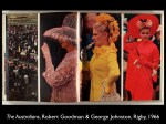
THE AUSTRALIANS
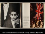
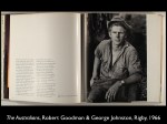
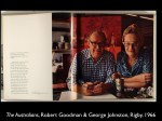
Goodman shot the book during 1963 and 1964, including a six-week caravan trip with his wife and young son. Sidney Nolan introduced him to the novelist George Johnston, who had just returned from living in Greece, and whose just-published sentimental autobiographical novel My Brother Jack was receiving critical and popular acclaim. He agreed to write the text. Goodman said:
George’s text for the book is the most moving I have ever read. His simple prose, every page verbally keyed to the pictures, is magnificent. I couldn’t have written any of it. I’m an American, and no matter how long I stay here I will always be one. But George is fifth-generation Aussie, and he talks of his country, its people, its future and past, and makes it all meaningful to his own people. Anyway, when we got lined up, I simply went out and took pictures —30,000 of them altogether — and as I took them George and I would go through them together.
Although many other Australian photobooks at this period were making use of the new Asian printers in Hong Kong, Japan and Singapore, Goodman ensured quality control by seeking out the Adelaide independent publisher Rigby and the Adelaide printery Griffin Press. He said:
I must have been as bold as brass then. There I was on four bob a day, talking to top-line printers, ink manufacturers, book-binders, telling them about my huge project, saying I would consider using them! It paid off, though. I really got the cream of the profession working for me.
The London trained modernist designer Harry Williamson designed the book. Goodman even returned to the Kodachrome rolls he had shot on his first trip to Australia, and Williamson flipped them and re-cropped them. Williamson established a unifying design grid based on the shape of Goodman’s 35mm slides which, compared to other books and magazines of the period, cleaned up and de-cluttered each spread while establishing a continuity throughout the book. Williamson also worked closely with the New York based, former Newsweek editor, Jonathan Rinehart who Goodman had hired to help him edit the text and image together so that, in his words, ‘the book, in its final expression would be neither picture nor word book, but rather a beautifully intertwined volume with a unity all of its own.’
Goodman had already made important media connections during his earlier visit, particularly with the middle-class travel magazine Walkabout who, a year out from the book’s publication, began to build anticipation for it by covering his travels around Australia with his wife as a photo story in its own right. In the lead up to the release date the publishers took out a series of ads in the booksellers’ trade journal Ideas.
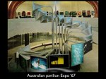
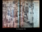
When it finally hit the shops in September 1966 the book was supported by an unprecedented publicity blitz, with articles and mentions in almost every magazine and newspaper. The coverage was tailored to each magazine, the Women’s Weekly highlighted the support of his wife and young son, while Australian Photography showed a display of all the Nikon camera gear he had used. The book became a favourite corporate and government gift — the Queen and President Johnson received theirs bound in merino skin. Enlargements and transparencies from the book also became the centrepiece of the modernist architecture for Australia’s Expo ’67 pavilion.
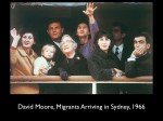
The book used sequencing to comment on Australian identity in the 1960s. For instance, as we turn from a vertical colour shot of distant backlit figures walking down a Sydney street beneath a Union Jack, to the next page, we are suddenly confronted with a double-page full-bleed spread containing a black and white close-up shot of three southern-European faces looking ahead with keen, lip-biting trepidation — ‘Immigrant Arrivals, Sydney Harbour’, the caption tells us. This spread describes the demographic change happening in Australia with a startling telephoto intimacy unprecedented in previous Australiana books. (The image was copied about a year later by David Moore on his assignment for National Geographic, but Moore’s version Migrants Arriving in Sydney 1966, eventually became a national icon.) Williamson also used colour with confidence. For instance the series of vertical slices arrayed across two pages conducts a kind of kind of typological census, in pink, yellow and red, of three generations of Australian womanhood at the Melbourne Cup.
The flavour of The Australians was determined by its international context. The fact that Goodman was a visiting American was articulated by the publicity as an advantage — as an unprejudiced but internationally knowledgeable outsider only he could see us as we really were. The book’s chapters followed a trajectory very familiar from lots of other Australiana photobooks — from the ‘Land’ to the ‘People’ to ‘Industry’, to ‘Arts’, to ‘Sport’ and finally to ‘Anzac’ — but they were given personal colour by a series of short written vignettes mixing Johnston’s nostalgic recollections with anecdotes and social speculation.
Reviews confirmed that The Australians had set a benchmark because of the physical quality of the book and because it broadened the themes and issues which could be encompassed by an Australiana photobook. The Australian newspaper, picked up on the book’s fundamentally optimistic and nationalistically flattering message. Although the faces in the book had ‘the sun cracked texture of parched land’, nonetheless they ‘did us proud’ in a way ‘that may seem oddly old fashioned in these days of national self analysis and criticism’.
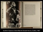
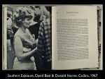
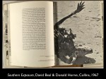
The book not only flattered Australians, it also flattered the mining, travel and finance companies who had backed it. Its unprecedented financial success encouraged other photographers to move into the market it had opened up, but it also goaded them into replying to its corporate jingoism. The most trenchant reply came the next year from Southern Exposure, a book with a text by Donald Horne, whose ironically titled The Lucky Country had been a talking point since its publication three years before, and photographs by David Beal, whose black and white images, rather than having the chromatic chutzpah of the classic National Geographic shot, had heavy doses of the gritty documentary acerbity of Bill Brandt and Robert Frank. The dust jacket blurb is clearly directed at a reader who is already thoroughly familiar with the success of of The Australians:
Southern Exposure is the most original picture book on Australia yet to be published. It marks a departure from the stereotyped, quasi-official, ‘coffee table’ productions which portray in verbal and visual clichés an idealised picture of Australia. […] ‘We are trying to get down in pictures and words the Australia we see.
The cover images are almost satirical. A beer-gutted Australian worker holds a shovel but incongruously licks an ice cream – almost a visual encapsulation of the argument of The Lucky Country – while on the back cover the ‘real’ Australia remains cracked and parched. The faces in Goodman’s The Australians were frontal and open with level gazes, whereas the faces in Beal’s Southern Exposure are belligerent or turned away. Their gobs are plugged with bottles, cans or cigarettes. Turning the pages doesn’t produce dramatic revelations, as in The Australians, but sardonic puns. For instance, a visiting English actress’s bejeweled décolletage at an opening night transmutes with the turn of the page into an empty beer glass shoved down a female pub drinker’s blouse. Other images, such as bleached animal skeletons, a major visual trope of postwar Australian iconography in painting and photography, seem to be out to trump Goodman’s more glamourised depictions. Compared to the ragged imprecation of Beal’s desiccated kangaroo in Southern Exposure, Goodman’s ‘Dead Ram, Witchelina Station, South Australia’ in The Australians begins to look almost choreographed. Rather than looking weary but quaintly proud as in Goodman, Beal’s returned Anzac soldiers just look smug and slovenly.
Southern Exposure raised the hackles of Walkabout, the travel journal that had doyens from the travel industry on its board which had directly supported Goodman’s The Australians. They complained:
The spate of picture books seems to be running into side-channels, not without stirring up mud. Southern Exposure is an example. […] This new genre of picture-book, solidly established last year by The Australians, was given an impeccable and sophisticated pattern by George Johnston’s text and Bob Goodman’s pictures. A welling, wholesome sanguineness swept through it. Australian frailties were admitted with grace, but Johnston’s pride in and Goodman’s American admiration for a people who had tamed but had been simultaneously moulded by a fiercely raw nature, and from scruffy beginnings had built a nation with no small part in the world’s affairs, arts, sciences and sports, seeped through unashamedly. Achievement was the keynote. [But] In [Southern Exposure], people will read what is tantamount to a lecture to Australians themselves from a superior posture of niggling, radical intellectualism.
Elsewhere I have argued that Beal and Horne’s reply to The Australians was followed by important books by Jeff Carter, and Rennie Ellis and Wesley Stacey, which were also not only published in the wake of, but defined against, The Australians. To quote Harry Williamson in a recent email to me: ‘David Beal, Jeff Carter, Wes (Stacey) and Rennie (Ellis) bring a gritty extension to what Bob Goodman started, and although in some ways he made it possible to get those books out and published, it was never something he would have intended to achieve himself.’
BACK TO HAWAII
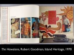
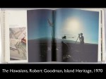
After the success of The Australians the trio of Harry Williamson, Jonathan Rinehart from New York, and Goodman stayed together and discussed other potential countries where businesses would want to invest money on publicising themselves and their country, such as South Africa, Mexico and Israel. However Goodman returned to his spiritual home Hawaii and the three worked on the book The Hawaiians, which came out in 1970. It closely followed the template set by The Australians: the cover also featured a frontal open face, the layout followed the same 35 mm shape across the double page spreads, there was a special deluxe edition, and presumably free copies for the thirty-four corporate sponsors.
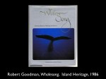
Rather than using a small independent publishing company, in Hawaii where he intended to live, Goodman set up his own company, Island Heritage. He offered Williamson a position in the company but Williamson decided to stay in Australia. Back in Hawaii Goodman eventually became more interested in book publishing than photography per se. With his friend Robert Spicer he produced a series of children’s books based on traditional folk tales in Hawaii. He became part of the renaissance of Hawaiian culture through his publishing association with the Hawaiian artist Herb Kane. After working on an early Macintosh computer to design a 1986 book about the Hawaiian whaling industry Whalesong, he became an advocate for desktop computer publishing.
CONCLUSION
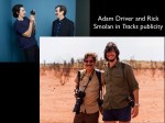
Goodman wasn’t the only photographer to publicise Australia to an international market. The world famous photographer E O Hoppe toured here in the late 1920s to add to his series of books on Britain, Germany and America with one on Australia. Called The Fifth Continent, it also mixed national typologies with landscapes; and from 1958 David Moore attempted to carve out Australia, S E Asia and the Pacific as his patch through The Black Star agency. And then of course there is Frank Hurley, who was similarly self-promotional, and who died in 1962, the year Goodman first arrived in Australia. However although Hurley exhibited his exploration films internationally, his Australiana books were aimed at modest domestic audience and had none of the social identity dimensions of Hoppe, Moore or Goodman. Ten years after Goodman left Australia another American National Geographic photographer came to our distant shores. Just like Goodman had before him, at some stage after photographing Robyn Davidson’s camel Journey for National Geographic in 1977, Rick Smolan (played by Adam Driver in the movie Tracks) conceived of his A Day in the Life of Australia book, where ‘one hundred of the world’s top photojournalists photographed Australia over twenty-four hours during 6 March 1981’. This was a similar to the business model Goodman had developed — both in its audacity, and in its invitation for the world to come and ‘show us to ourselves’. Goodman’s series only reached two countries, but Smolan’s A Day In The Life of … series extended from its beginning in Australia, to Hawaii (like Goodman) then to Canada, Japan, America, California, Spain and the Soviet Union.
Despite their differences all of these photographers deployed the same sets of elements: their own special personalities as galvanizing global photographers, their individual attempts to create new markets for photography, the compelling power of an international gaze trained upon Australia, which reflected back to a domestic audience tropes of Australian identity, such as national typologies or nationalistic landscapes, with increased intensity. In the case of all these photographers the international spotlight became a national mirror.
The memory of Goodman’s galvanizing effect on Australian photography has now been almost completely forgotten. For instance I myself remember, in 1981 as a Marxist, Foucaldian, Barthesian art student, attending a PR event about the production of Smolan’s A Day in the Life of Australia. As a postmodern cadet I was there to condemn and sneer at its clichéd depiction of Australia, but I still remember one bearded old photographer, I don’t remember who, saying that until A Day in the Life of Australia we had had no better picture book to send overseas than Goodman’s The Australians, which was at the time fifteen years old. ‘What was this book?’ I remember wondering at the time, ‘who was this Goodman? I had never heard of him.’ ‘Since I hadn’t heard of him, he certainly couldn’t be important’, I thought to myself at the age of twenty-two. But clearly Goodman’s trajectory through Australia had reverberated for at least fifteen years, and now I think it is time it is recognised again.
Martyn Jolly


Composite Propaganda Photographs during the First World War 2003
pdf: composite propaganda 2003
‘Composite Propaganda Photographs during the First World War’,
History of Photography, Vol 27, No 2, Summer, 2003, pp 154-165
During the final two years of the First World War, a series of propaganda photography exhibitions were held in London. The centrepieces to these exhibitions were giant mural enlargements. Some of these spectacular battle scenes were artificially coloured and some were composites produced from several different negatives. The exhibitions were popular successes, and the mural images attracted favourable press attention. They also produced a degree of controversy behind the scenes with respect to their status as ‘fakes’.
Pictorial War Propaganda in Britain
In the first years of the war, all forms of propaganda began to be used more frequently and more strategically by all belligerent nations. By 1916 war propagandists were taking seriously the potential of pictorial propaganda. Britain appointed official photographers and set up a pictorial department to distribute British photographs and films overseas. From early 1917, when the war had bogged down in the trenches and there was danger of public disaffection, propaganda became as concerned with managing domestic opinion and mood as with promoting foreign policy interests abroad. By the closing stages of the war it had become apparent ‘that almost for the first time in history success in war had become directly dependent on general public opinion’. Pictorial propagandists quickly recognised the importance of the new media, such as the cinema or illustrated newspapers, for disseminating their images. Images became central to public understanding of the war, and photography and film supplanted the written word as the most powerful weapon in propaganda.
The driving force behind pictorial propaganda in Britain was Lord Beaverbrook, a Canadian financier who, as Max Aitkin, had come to Britain in 1910 and quickly rose in politics through his wealth, newspaper interests as owner of the Daily Express, personal friendships and high-level political allegiances. At the outbreak of the War, Aitkin persuaded the Canadian Prime Minister to make him ‘Official Canadian Eyewitness’. In January 1916 he was allowed to set up and run the Canadian War Records Office. By the end of the year he had also become the Chairman of the British War Office Cinematographic Committee. Early the following year the new British Prime Minister Lloyd George granted him the peerage of Lord Beaverbrook as a reward for his support in the overthrow of the Asquith government. A year later, in 1918, Lloyd George made Beaverbrook Britain’s first Minister of Information. Beaverbrook energetically set about shaping what had previously been piecemeal efforts into a single operation.
From the start British propagandists distanced them¬selves from the sensational fabrications and gross jingoism of Boar War propaganda. In the phrase of the first head of the British Foreign Office’s Bureau of Propaganda, Charles Masterman, they were to use ‘the propaganda of facts’.2 While acknowledging this tenet, Beaverbrook demonstrated a more sophisticated understanding of media-based propaganda within the complex and fragmented social environment of wartime Britain. When he became Britain’s Minister of Information in 1918, he declared what his approach had been throughout the war. Public opinion must not be allowed to form itself, it must be formed for it — by the truth certainly — but the truth ‘in an acceptable form’:
It is useless to imagine that the mere existence of a fact will penetrate everywhere by its own weight, or that facts themselves do not requrre treatment according to which audience they are to be presented. Public opinion is indeed so volatile a thing that nothing except a mixture of tact and persistence will induce it to accept and realise what to the preacher is self evident.3
Earlier, as head of the Canadian War Records Office, Beaverbrook had realized that photography would be central to the documentation of this war because it was thoroughly in tune with the dual responsibility of a government records office to disseminate information and collect documents. The photograph was able to operate along both the axes of publicity and record keeping, propaganda and history. Photographs took part in the urgency of the moment, while simultaneously implying the importance of that moment for posterity. ‘Many of these have not yet passed the censor’, wrote Beaverbrook, ‘but five or ten or twenty-five years from now, they will be shown to us and our sons and will link the decades together in a way unimagined by our ancestors’.4
Beaverbrook also had the most acute understanding of anyone in Britain of the importance of photography and film for the new psychological depth of the task propaganda had to perform. He felt the visceral primacy of the image over the written word, and he understood the importance for war propaganda of the technical affinity that the most modern forms of visual experience had with the most modern forms of warfare.
Under modern conditions nations are fighting and are sacri¬ficing bone and sinew to an extent never known before — and realisation alone can justify the sacrifice. We must see our men climbing out of the trenches before we can realise the patience, the exhaustion, and the courage which are the assets and trials of the modern fighting man.”1
As the war dragged on, photography became even more important to Beaverbrook because the directness of the image was able to combat the fatigue the public was feeling with respect to the war itself and with the increasingly hollow-sounding rhetoric of traditional propaganda. Photographic facts addressed themselves particularly to the working classes and were able to form a direct point of contact between the totally estranged experiences of those in Britain and those on the front.
It is hard enough for the civilian, on whose endurance to the end the issue of the world war depends so largely, to realise conditions at the front: without photography it would be practically impossible. But what the mind can’t take in by the reading of descriptions, the eye can assimilate from the actual outline of the scene and the men depicted on the plate. Besides, the great bulk of mankind soon wearies of the word. At the bottom of his heart man feels of the war story that of the makers of such books there is no end, and that much study of them is weariness to the flesh. Photography has about it the convincing atmosphere of naked reality. He has only got to open his eyes to see it. So is modern science applied to the acts of war as well as of peace.’
Beaverbrook’s other innovation as head of the Canadian War Records Office was to use the established film and photography trades for the production and dissemination of propaganda. The official British and Canadians photographers
came largely from London’s most pictorially oriented illustrated newspaper, the Daily Mirror, which had since 1904 exclusively used photographs as illustrations. The Canadian official photographs were licensed for distribu¬tion through picture agencies on a commercial basis. ‘No propaganda reaches the hearts and minds of the people’, wrote Beaverbrook, ‘unless it is so convincing and that the public is ready and anxious to pay a price to see or read it’.7
In addition, in the emerging mass media environment of the time, there were many rivals for the attention of the public, and appetites easily became jaded. In this context, a fundamental principle of propaganda must be that ‘obvious propaganda is not only of little value but may even do more harm than good.’ Although Beaverbrook wanted his images to carry the authoritative premium of the ‘official’ imprimatur, he also wanted them to become an intimate part of the public’s media consumption, a consumption that was driven by the compulsions of choice and desire. Moreover, because this public appetite was changing and continually seeking formal novelty, only trade photographers trained under commercial imperatives, not bureaucrats, could provide effective propaganda.
Official war photographs were disseminated into a very fluid, polyvalent media environment. In the illustrated papers of the time photographs were not diegetically integrated into the news articles. They were generally given their own section in the paper — in the case of the Daily Mirror, as a front page, back page and centre double-page spread — with supporting captions. The caption might denote either a non-specific ‘scene at the front’, or a specifically reported on raid. Valencies of authenticity and scenographic legibility were exchanged between different kinds of image and text across the page. Photo¬graphic realism became the core model for all illustration, and the fresh, proximate, eyewitness report became the model for all text. Illustrated magazines such as the Illustrated London News, for instance, which still largely relied on drawing and paintings to convey scenographic information, often published an uninformative photo¬graph of a particular engagement, followed by a stirringly composed drawing of the same engagement, with the caption ‘drawn from eyewitness accounts’.
Although the intrepid official photographer became a key figure in this newspaper landscape, the idea of the ‘photojournalist’ — the autonomous photographer inde¬pendently reporting on events as they unfolded — made no sense at the time. Official photographers were given honorary ranks and saw themselves as propagandists, not reporters, their photographs were part of the war effort, not a comment on it.
The Problem of the ‘Fake’
In this context, propagandists and photographers found themselves having continually to finesse the balance between
the qualities of authenticity, actuality and immediacy in their images and their legibility as historical scenes. This was new iconographic terrain, where everything was at stake. The value of authenticity had never been more politically crucial, but at the same time the need to provide scenographic spectacle to feed the public appetite for images, and the need to re-cohere fragmentary and disjointed images into readily legible pictures, created a huge temptation to fake.
Faking took place in several forms. Photographs taken during training were passed off as real battle reportage or scenes were deliberately staged for the camera. Photographs themselves were manipulated with bomb blasts or aeroplanes being montaged into the pictures, and elaborate composites were sometimes constructed from several negatives. Virtually every photographer or filmmaker faked to some extent, and everybody seemed to know about it.
Not only did the accusation of fake directly threaten the propagandistic value of the photograph or film, it could also upset the internal politics of the army and undermine the photographer’s honorary position within its structure. Fakes could bring photographers and cinematographers into disrepute with soldiers at the front. For instance, a shot with a dog supposedly minding its master’s kit and rifle in the snow was returned to the official photographers from General Staff with the terse note: ‘I am instructing the photograph censors not to pass this type of photo in the future. To every soldier serving with a combatant unit, this must be patently and obviously a “fake”‘.10
Although such instances of faking remained relatively rare, and were usually officially disavowed and surrepti¬tious, they were nonetheless an integral part of pictorial propaganda. In his position as the Chair of the War Office Cinematographic Committee, Beaverbrook sacked a Lieutenant Bovill, a film cameraman, because his wholesale faking made his footage useless. At the same time, Beaverbrook continued to sponsor the successful British film cameraman Lieutenant Malins and Canada’s official photographer Ivor Castle, both of whom were widely suspected to have faked from time to time.
Propaganda Exhibitions
The most explicit ‘fakes’ made during the First World War were the central set pieces to a series of massive photographic exhibitions that Beaverbrook initiated. In 1916 and 1917 Beaverbrook organised two exhibitions of ‘Canadian Official War Photographs’ at the Grafton Galleries in London. The success of these exhibitions led to two British exhibitions: an exhibition of ‘Imperial [British, Canadian and Australian] War Photographs’ at the Royal Academy in January 1918; and ‘British Official War Photographs in Colour’ at the Grafton Galleries in March 1918. By this time Beaverbrook had become Minister of Information. The Australian War Records Section concluded the sequence with an exhibition ‘Australian Official War Photographs and Pictures’ at the Grafton Galleries in May 1918.
The first Canadian exhibitions not only went on to tour — first in England and then to France and to North America — but they were also the locus for considerable press attention, visits by royalty and huge public attendance. They were partnered as media events by the reproduction in newspapers and magazines of images made from them. They were also points from which images were sold to the public in a variety of formats and prices, ranging from nine pence to several hundred pounds.
These exhibitions were organised by Ivor Castle, an experienced English press and war photographer, whom Beaverbrook had recruited to the Canadian War Records Office in mid 1916 from the photography department of the Daily MirrorV Castle photographed Canada’s role in the disastrous Somme offensive of late 1916, and then returned to London to mount in December 1916 the first exhibition of over 200 Canadian War Photographs. The photographic printing company Raines & Co of Ealing enlarged these negatives to sizes ranging from one square metre to two by three metres and mounted them in heavy oak frames. The proceeds from the picture sales went to the Canadian War Memorials Fund to pay painters to paint grand battle pictures for a post war memorial.
Captions to photographs in this exhibition emphasizd both the technical sophistication of the photographs, and the bravery of the photographer:
Heavy Barrage Fire
This is the only panoramic photograph of a shell barrage in the world … It is obvious from the picture the risk which the photographer ran in taking it.
The Shelling of Courcelette
The photographer approached as near to the scene as he could without being killed, and declares it to be a veritable ‘hell on earth’.12
In this exhibition, however, staged photographs were also shown without compunction. The exhibition’s central sequence of photographs, which supposedly showed lines of troops heroically clambering ‘over the top’ into an onslaught of enemy machine gun fire, was in fact taken behind the lines at the St Pol training school. The canvas breech covers on the training rifles held by the soldiers had been cropped out, and shell bursts, which were probably shot separately at the nearby trench-mortar school, had been montaged into the sky.1
Shortly after the photographs had been staged and three months before their display in the exhibition, this sequence had been received enthusiastically by the press, which had published them as up-to-the minute news photographs. They were published by the Illustrated London News with the caption: ‘”Over the Top”: The meaning of a phrase now familiar.’14 They were also reproduced on the front page of the Daily Mirror, with the caption ‘These Striking Photographs Show In Vivid Fashion An Attack By The Canadian Troops’.13 A month later the Daily Mirror published them again, along with a dashing portrait of Ivor Castle posing in a trench (figure 2), in order to advertise their sale as postcards, with profits to go to the Canadian War Memorials Fund.16
When the enlargements were exhibited at the Grafton Galleries two months later, they relied on a more elaborately fabricated catalogue text to verify them:
The Last Over The Top
Here is to be seen a remarkable picture of a German shrapnel shell bursting over a Canadian trench just as the Canadians are going over the parapet. A fragment from this shell killed the man whose body is seen sprawled across the parapet.17
This incident of staging remained officially unac¬knowledged, and Castle, coming from a commercial background and having a flare for publicity, went on to exaggerate his personal derring-do in the magazine Canada in Khaki: ‘Taking photographs of the men going over the parapet is quite exciting. Nothing, of course, can be arranged. You sit or crouch in the first-line trench while the enemy does a little strafing, and if you are lucky you get your pictures’. This studied insouciance gave Castle’s colleague on the Daily Mirror, William Rider-Rider, who was the second official Canadian photographer recruited to the Canadian War Records Office in June 1917, a lot to live down when he visited some units. There, he later recounted, he was met by remarks such as, ‘Want to take us going over the top? Another faker?’19
As the exhibition toured to Canada and the United States over the next two years, the ‘over the top’ pictures continued to be met with press acclaim for their realism, vividness and sense of immediacy. In all of these press accounts the figure of the intrepid photographer, who like the soldiers themselves risked death to capture his shots, figured strongly.
Cinema Propaganda
Castle staged his ‘over the top’ pictures at about the same time as the seminal propaganda film Battle of the Somme was breaking all box office records in Britain. The centrepiece to the film was a similarly stirring ‘over the top sequence’, which had been filmed a month or so before. The first two shots in the sequence were staged, probably also at a training school behind the lines, by the British War Office’s Official cinematographer, Lieutenant Geoffrey Malins.”
The Second Canadian Exhibition
After the success of his first Canadian exhibition, Castle remained in London until April 1917, when he returned to France and photographed the Canadian victory at Vimy Ridge. These photographs formed the basis of the second exhibition, also sponsored by the Canadian War Records Office, which opened in July 1917 (figure 3). Like its predecessor this exhibition featured 188 enlargements in oak frames, some of which were further enhanced by artificial colouring. The pictures were reported as depicting the Canadian operations with a ‘terrible realism’ and supplying a ‘most intimate insight’ into the difficulties of the front.”1 As in the first exhibition, the intrepidity of the official photographer was highlighted in the catalogue.
Barbed Wire and the Shells
The Canadian official photographer was out along the front line when the Germans suddenly began a bombardment. The pho¬tographer had to take cover for three hours, but he emerged periodically to take pictures of the Germans’ morning ‘hate’.
The Death Cloud
It is one of the hardest things in the world to get a really good ‘snap’ of bursting shrapnel. Pretty as this little cloud of smoke looks, it is very deadly, and the man who handles the camera at such a moment does so at the risk of his life.
Many of the pictures were giant enlargements. The catalogue drew the visitor’s particular attention to picture
number 158 (figures 4, 5), ‘which is the largest photo¬
graph in the world taken on “no man’s land” by the
Canadian Official photographer as the Canadians went over to the attack on Thelus Village’. The picture would have been hard to miss since it occupied an entire wall of the central gallery and measured six by three metres. Raines & Co had printed it in five separate panels. The image was a composite of several different negatives, with printed-in shell bursts in the sky and printed-in bodies in the foreground. The catalogue’s extended caption served as a film-like commentary, taking the visitor step by step through the correct way to experience the picture:
The Taking of Vimy Ridge
No individual soldier taking part in a modern battle can have the faintest idea of the scope of the battle, or the conditions of that battle. Distance and perspective are necessary to secure the correct impression of the actual facts. For this reason it is idle to stand close to this picture. It must be looked at and studied from a sufficient distance to enable one to understand the immensity and importance of the scene before one. It is true that the Canadian Official photographer, who took this picture, was in the midst of the men who were advancing to the attack, but knowledge of his craft alone enabled him to take a picture, the real wonder and sense of which can only be studied with quiet reflection and at a distance. Nonetheless the terrible nearness of things in which the photographer stood, which enables one to, as it were, ‘watch the battle from the neighbouring hill’, at the same time sweeps one into the conflict. One becomes absorbed into the picture. It is as though one were on the battlefield itself. The picture of the battle is taken in profile. It is taken from the flank looking along the line of attack. To the left of the picture, beyond the frame, one must imagine the smoke of our guiding and sheltering barrage fire. Guiding, yes, but sheltering only to a degree. Through that barrage the German shells are hurtling. The white smoke in the distance, which lies along the ground like a dewy mist above meadows at dawn, is smoke from the counter barrage of the German’s piercing our own. Every fleck of smoke, indeed, in the grim sky is smoke from bursting enemy shells. The great splodges of black smoke show where German shrapnel is showering thickly. Far along the ridge, in the middle distance, through the lane of men, may be seen the tanks heavily engaged. In the immediate foreground lie those who have already made the supreme sacrifice. Between, strolling to their ‘rendezvous with death’, are the men who made Vimy deathless. At the moment they are on what had been ‘no man’s land’ but a short time before; there still protrude from the broken ground the supports which held the German wire entanglements swept away from our guns. It is an awful pageant of war as it is waged today. It is an impression, nay, indeed a reality, of the splendid horror snatched by the photographer, in the fraction of a second, from the clutchings of death.23
This extended description not only navigates the audience through the abstracted, fragmented and disorienting experience of modern warfare, but also instructs it how to experience the picture in the gallery space. The viewer is asked to immerse himself within the battle, while also retaining a distance from it. This phenomenological act of doubling attempts to project an experiential bridge between those in London and those in the trenches. It links the two new, modern experiences — warfare and giant photograph exhibitions — through the mechanisms of nationalist empathy and the virtual space created by advanced photographic technology.
Like the first exhibition, this one was a spectacular success. At one point people queued for nearly two hundred metres to get in, and the exhibition raised £1100 for the Canadian War Memorials Fund. It was also the occasion for much associated press coverage. The Daily Mirror, whose photography department Castle had formerly headed and to which he would return after the War, was especially enthusiastic:
WAR PICTURES WITHOUT EQUAL,
CANADIAN BATTLE SNAPS, SHOTS THAT
WILL THRILL
To gaze, for instance at the huge picture showing the Canadians going to the attack at Vimy Ridge is to be carried away in imagination to the grim realities of war. To obtain a full impression of the splendid awesomeness of this amazing masterpiece of photographic art the visitor should stand some distance away. The result will be thrills as if one were on the battlefield itself24
The exhibition later toured Britain, and a copy went to Paris and Canada. The success of the Canadian War Records Office did not go unnoticed. John Buchan, head of Britain’s Department of Information, wrote in August 1917 to Sir Reginald Brade of the British War Office. He wanted to revamp and increase the support and supervision afforded to British photographers because the flood of good quality Canadian photographs was lending support to criticism in the US press that ‘Canada [was] running the war.’ Buchan was opposed, however, to emulating Beaverbrook by putting British propaganda photography on an entirely commercial footing. He did not want to tie distribution to the monopoly of one commercial agency and, balking at Beaverbrook’s commer¬cial understanding of the new dynamics of public image consumption, thought it unwise to restrict attendance at propaganda exhibitions by charging admission.”3
Castle’s use of composites had the full support of Beaverbrook. He was planning an exhibition of Imperial War Photographs for January 1918 and was determined to retain the right of the Canadian Office to make composites for display. ‘Fake them … that’s what you could call it’, he declared in a meeting.” He brazened down British General Staff by directly requesting a ruling from the Chief Censor as to how they should be treated. He received the crisp reply: ‘All photographs whether “composite” or single exhibited as representing an actual scene on the Western front should be censored. If the Canadian Photographic Section care to exhibit “composite” photos clearly marked as such, then it will suffice if each separate photo has been censored’.27
The biggest composite was produced not for the Canadians, however, but on behalf of the British, for the exhibition ‘British Official War Photographs in Colour’ held in March 1918. Beaverbrook now led Britain’s Ministry of Information, and Ivor Castle probably orchestrated the composite, although he was still nominally attached to the Canadian War Records Office. At Raines & Co the photographs in the exhibition were printed in sepia, then broadly hand coloured with spray guns, before being coloured in detail by hand. They were mistakenly assumed by some daily newspapers to be colour photographs.~x Mounted prints measuring 1.3 by 1 metres were on sale for £150, with an additional 50% added for hand colouring. The catalogue to the exhibition proclaimed:
Great Record of the War
No photographic exhibition has ever been attempted on such a scale before. It comprises many thousands of square feet of photographs, coloured under the supervision of experts, with the most particular care to detail. Truth to colour has never been sacrificed for the sake of creating an impression, but nonetheless the impression which this amazing collection conveys will be ineffaceable. If all the Master Artists of the world had laboured for a year they could not have produced a record of War so humanly vivid, arresting and complete. One walks through the doors of the Grafton Galleries on to the grey flats of Flanders, and on to the golden but burning sands of the deserts of the east. It is as though one was transported on a magic carpet into the battle zone half the world over. This wonderful collection is the apotheosis of the camera. The unflinching eye of the lens has looked on the War
in all its aspects, and has recorded more faithfully even than any historian could do, the greatest and the smallest things in the greatest and most wonderful war in history.-
The centrepiece to the exhibition was the new ‘largest photograph in the world’ (figure 1), a hand-coloured composite, which, despite General Staffs request, was not identified as such:
Dreadnoughts of the Battlefield This, the largest photograph in the world, was taken during a recent advance on the Western Front. The tanks, those giant landships which indomitably plough the oceans of mud in France and Flanders, are moving forward to attack. In the photograph heavy shells may be seen bursting thickly in the line of their path, but no barrage daunts them. The picture is so vivid that it brings the realisation of modern battle into the heart of London. The best way to appreciate its wonders is to stand away from it as far as possible, when every detail will stand out in stereoscopic relief. The picture actually measures 23ft 6in by 17ft, without the frame, and it was necessary to make it in two sections, as the builders of the Galleries never anticipated a ‘canvas’ on such a scale. Neither doors nor windows could accommodate a picture of such gigantic dimensions.3″
This picture therefore subsumes into itself all previous and rival technologies: the humanity of the history paint¬ing, the magic carpet ride of cinema and the corporeally based illusionism of the stereoscope. The magnitude of this gesamtkunstwerk can only be achieved through composite montage, but this montage has to be disavowed in order to preserve the integrity of photographic verisimilitude, while inscribing it into a new regime of modernist spectacle. As a Ministry of Information press article commented: ‘It is a far cry from the old garish family group pasted in the album of Victorian days to the great picture twenty-four feet by seventeen feet showing the first tanks in action.'” When the King and Queen visited the exhibition to view ‘the soul of the War laid bare in pictures’, they remained for a long time in front of this picture. The King remarked that the photographs were the finest he had seen.32
After two months at the Grafton Galleries, the exhibition had been seen by a quarter of a million people and had raised £7000 for charity. The exhibition was then moved into the East End, to the People’s Palace in Mile End Road, presumably to address itself more directly to London’s working classes. A smaller version of the exhibition simultaneously toured smaller towns, and a set of battle photographs was prepared for dispatch to the United States.
Australian Propaganda
The establishment of a Canadian War Records Office in January 1916 had been a model and a goad for Australia’s War Recorder, C.E.W. Bean, to agitate for the establish¬ment of an Australian War Records Section, which he finally achieved in June 1917. The Canadian office was always more generously resourced and commercially aggressive than the Australian section. Because of Lord Beaverbrook’s status as simultaneously Canadian War Records Officer, Chairman of the British War Office Cinematographic Committee, Peer, newspaper proprie¬tor and Whitehall power broker, the Canadian War Records Office had also had much more weight in London. In fact, in late 1917 and early 1918 Bean had to fend off several attempts by Beaverbrook to bring the entire Australian photography section under his wing.” The two organizations also took radically different approaches to their work. Bean was a reporter and a historian. Although he sometimes skewed his reportage for propaganda purposes, he was nonetheless committed above all else to making a record of the war, which he saw in nation building terms.’4 Beaverbrook was a poli¬tician and newspaperman, committed to propaganda and publicity and, above all, the management of public opinion.
Like Beaverbrook, however, Bean was also convinced of the crucial role the photograph must play in war records, not because of its propaganda charge but because of its status as an inviolable historical artifact. Beaverbrook used experienced English press photographers as Cana¬dian official photographers because they knew best the contemporary media landscape. Bean wanted to use Australian photographers to record Australian soldiers, because they would be contributing to the foundation of an Australian heritage. In August 1917 the two Australian photographers Bean had requested — Hubert Wilkins and Frank Hurley — were appointed directly to the Australian Imperial Forces.
After a few weeks at the front, one of the photogra¬phers, Frank Hurley, became convinced that the only way to make convincing battle photographs was to make composite prints. Hurley was already well acquainted with the techniques of composite printing. Before the war he had read a paper to the Photographic Society of New South Wales on the subject, demonstrating his study by combining several different negatives taken of different animals at the zoo into a single scene, complete with clouds.” * He had also made composite prints in London just before his appointment as an Australian official photographer.
In November 1916 Hurley had arrived in London as a hero. He was the photographer and cinematographer of the Shackleton Antarctic expedition, which had just returned to London after a sensational escape from the ice. On 5 December 1916 Hurley’s expedition photographs were published exclusively across all of the photography sections of the Daily Mirror. The Shackleton expedition had been financed against expected future earnings from the sale of the film and photograph rights. Because much material had been lost in the crushing of the Endurance or left on the ice, the backers of the exhibition decided that Hurley should return to South Georgia to shoot more wildlife scenes to supplement the Antarctic material. Before leaving in February 1917, however, Hurley worked in the darkrooms of the Daily Chronicle, owned by one of the expedition’s backers, as well as with the Paget Company, where his colour lantern slides ‘were developed, and at Raines & Co, where his negatives were printed. During this period, Hurley made the most of the limited number of plates that he had brought back from Antarctica by combining some of them into composite prints. He also worked with a variety of British companies to manufacture cutting-edge display technology for the marketing of the expedition’s photographs and films. Newtons, for instance, who were lantern slide experts, constructed a special lantern able to project colour images on to a screen five metres square.
Hurley was in London, working with the Shackleton material at Raines & Co and making composite prints, during the period when the Canadian exhibitions were being mounted. He would have easily recognized the printed-in clouds and composites, but his diary does not record that he visited the exhibitions. Nor does it record him meeting Castle until a week or so after his own decision to make composite prints of the fighting in Flanders.’
Hurley and Charles Bean had a running argument, extended over several days, about Hurley’s right to make composites.37 The idea was anathema to Bean, for whom the war photograph was becoming a sacred, inviolable historical artefact. The example of the Canadian composites was there for each man to draw upon as they argued. Bean wrote in his diary:
[HIad a long argument with Hurley who wants to be allowed to make ‘composite’ pictures for his exhibition … I can see his point, he has been nearly killed a dozen times and has tailed to get the pictures he wants — but we will not have it at any price. The Canadians to some extent print their battle pictures with shell bursts from other photos — but we don’t want to rival them in this.’
Hurley, on the other hand, declared to his diary:
I am unwilling and will not make a display of war pictures unless the Military people see their way clear to give me a free hand. Canada has made a great advertisement out of their pictures, and I must beat them.’
At about this time Beaverbrook had approached Hurley to make composite prints for the Canadians outside of the Australian areas. ” This may have been what emboldened Hurley to threaten to resign he if did not get his way. Australian GHQ eventually gave Hurley permission to reproduce six composites, requesting only that they be clearly labelled as such.
In early November Bean sent Hurley to Palestine to cover the Australian Light Horse. Away from the stric¬tures of the front and of Bean, he flourished. He found the Australian light horse battalions amenable to staging re-enactments for the camera. He met with the commanders beforehand and planned with them whole, day-long programmes of ‘stunts’.
In late 1917, while Hurley was still in Palestine, the other Australian photographer, Lieutenant Wilkins, chose the Australian photographs for the exhibition of Imperial Photographs. Each country had its own gallery, and a giant enlargement dominated each gallery. Incongruously, the Australian mural enlargement was not of a battle scene, but was a triumphal image of the Band of the 5th Australian Infantry Brigade marching confidently through the still smoking ruins of the French town of Bapaume (figure 6). Bean visited the exhibition, and it did not escape his notice that some of the Canadian photographs were composites. ‘Ours were simply and strictly true’, he observed, T would rather have them a thousand times’.
Hurley returned to London in May 1918 to prepare for the exhibition of Australian war pictures, organised in London through the Australian High Commission. He arranged to have 130 negatives printed, his six composites and other images enlarged to mural size at Raines & Co, and colour lantern slides made from the Paget colour plates. As well as Hurley’s composites, some of the photographs exhibited were of re-enactments. The Australian War Records Section attempted to ensure that they were given titles that protected them from the accusation of fake. For instance, a shot of a re-enactment of a charge at Gallipoli, probably taken behind the lines by the British official photographer Ernest Brooks, was entitled ‘Illustrating how the Australians charged the Turkish trenches at Gallipoli’. Some re-enactments slipped through the net, however, and officers visiting the exhibition commented upon those. The Australian War Records Section com¬plained to the Australian High Commission: ‘I have heard today a great deal of adverse comment upon the pictures. It comes from those who … know that the pictures cannot possibly be true, [they] say the obvious inaccuracy of the titling of the pictures made them doubt all the others, and in their opinion quite spoilt the whole show. Personally I am inclined to agree with them’. “
The exhibition still featured Hurley’s composites, however, most spectacularly showing a large composite exhibited under the protectively generalised title ‘The Raid’.43 The catalogue description of this composite was considerably more circumspect and ambiguous than the strident sensationalism of the captions for the Canadian and British composites, although it does retain their sense of cinematic montage.
The Raid
A large composite picture. Australian troops are seen advancing to the attack prior to the Battle of Broodseinde. A heavy enemy barrage is seen falling on the distant ridge. Aeroplanes are shown flying low for the purpose of machine gunning the enemy trenches. At the extreme right of the picture is an aeroplane down in flames. This picture shows the thick smoke and haze which are characteristic of the battlefield in this sector.44
Hurley was also keen to test the reaction of the soldiers to his composites:
Attired in civilian dress, I often mingled with the ‘diggers’ to hear their scathing criticism. When I find they approve and pass favourable judgement, then I feel confident such impression composites are justified.”13
Hurley’s composite was made up of twelve negatives and far surpassed Castle’s in intricacy. It was not coloured, however, nor was it the latest ‘largest photograph in the world’ (missing out by half a metre or so). Perhaps because giant composite murals had already been seen in London and perhaps because Hurley had no close personal links with the newspapers, the composites for which he had fought so hard aroused little interest in the London press. The lantern slides received more press attention. The British Journal of Photography reported that the half-hourly displays of half-plate Paget plates projected onto a full-size lantern screen were in fact the first real colour photographs to be exhibited of scenes and incidents of the war. Hurley’s status as an explorer photographer was also recognized, as well as his highly developed sense of the picturesque which, for the journal, was as important as the intrinsic interest of the subject. For instance, he exploited the emotional potential of colour by contrasting the ‘wealth of flower and foliage in France’ to the ‘ruin wrought by warfare close at hand’.41 The Times agreed:
A cluster of soldiers’ graves, described as ‘one of Australia’s most sacred spots’, is covered with flowers which have sprung from the shell scarred earth. It might seem that nothing could grow in such soil, and the ordinary photograph would have to be very good indeed to persuade to the contrary. But the coloured photograph is complete proof. These pictures …. should not be missed by any who would learn what photography can accomplish.
Like his British and Canadian counterparts, Bean was now fully attentive to the propagandistic potential of photographs and to the need to massage public opinion. Whilst the exhibition continued its run in London, Bean catalogued the official Australian photographs, including Hurley’s composites, that were to be made available for sale to the public directly from Australia House at a shilling each. Beaverbrook’s British Ministry of Informa¬tion was already selling official photographs directly to the public from a shop front at Piccadilly. Bean also produced several series of lantern slides for the recruiting authority in Australia. As he admitted, ‘the originator of this scheme was really Hurley’.
This extraordinary series of exhibitions attempted to engage, and then re-engage, the public directly in the war. Using all the new visual technologies then available, while drawing on familiar and long established modes of pictorial representation, they attempted to link the experience of the viewing public in London with the unimaginable experiences of those in the trenches. These images sold ‘thrills’ into a competitive marketplace, but thrills that attempted to bring together and reconnect a fracturing nation. Although these images coveted their authenticity, they were also willing to trade some of it in return for the values of coherent spectacle. Different propagandists and photographers evidently took different attitudes with respect to how many facts could be exchanged for how many thrills.
Notes
1. Beaverbrook, Memorandum for the Committee from the Minister of Information, House of Lords Records Office, BBK/E/3/4, 1918, 1.
2. J. Carmichael, First World War Photographers, London: Routledge 1989, 16.
3. Beaverbrook, Memorandum for the Committee, BBK/E/3/4, 1.
4. Beaverbrook, Report submitted by the Officer in charge, Imperial War Museum, Canadian War Records Office Records, 11 January 1917.
5. Ibid.
6. Beaverbrook, Draft of the ‘Ministry of Information, its Organisation and Work’ for publication in the Windsor magazine, HLRO, BBK/E/3/49, 18 June 1918.
7. Beaverbrook, Report submitted to the Officer in Charge, IWM, 13 March 1918.
8. Beaverbrook, Ministry of Information Minute, HLRO, BBK/E/2/18, 1918, 3.
9. For a more detailed discussion of illustrated newspapers during the First World War, see J. Taylor, War Photography: Realism in the British Press, London: Routledge 1991, 18-51.
10. M. N. Lytton, Note from Photography Section, GHQ, to Ministry of Information, IWM, Ministry of Information files, Box 1, No. 3, 8 January 1918.
11. Canadian official photography is discussed in greater detail in, P. Robertson, ‘Canadian Photojournalism during the First World War’, History of Photography 2:1 (January 1978), 37-52.
12. Catalogue of the Canadian Official War Photographs Exhibition, London: 1916,”n.p.
13. Robertson, ‘Canadian Photojournalism’,43.
14. ‘Over the Top’, the meaning of a phrase now familiar. The Canadians making one of their brilliant attacks. Men leaving their trenches’, Illustrated London News, London (21 October 1916), 4.
15. ‘GOING OVER THE TOP: A CHARGE BY THE CANADIAN TROOPS ON THE SOMME FRONT’, The Daily Mirror, London (16 October 1916), 1.
16. ‘CANADIAN OFFICIAL WAR POSTCARDS’, The Daily Mirror, London (6 November 1916), 4.
17. Catalogue of the Canadian Official War Photographs Exhibition.
18. I. Castle, ‘With a camera on the Somme, by the Official Photographer with the Canadian Forces’, Canada in Khaki, London: Canadian War Records Office 1917, 68.
19. Robertson, ‘Canadian Photojournalism’, 43.
20. For a detailed study of parallel issues in propaganda films see N. Reeves, Official British Film Propaganda During the First World War, London: Croom Helm 1986 and N. Reeves, ‘Official British Film Propaganda’, The First World War and popular cinema 1914 to the present, New Brunswick: Rutgers University Press 2000.
21. ‘News and Notes: Canadian War Photographs’, The British Journal of Photography (20 July 1917), 381.
22. Catalogue of the Canadian Official War Photographs Second Exhibition.
23. Ibid.
24. ‘WAR PICTURES WITHOUT EQUAL, CANADIAN BATTLE SNAPS, SHOTS THAT WILL THRILL’, The Daily Mirror, London (16 July 1917) .
25. J. Buchan, Utter to Sir Reginald Brade, War Office, HLRO, BBK/ E/3, 14 August 1917.
26. C. E. W. Bean, C. E. W. Bean Diary, Australian War Memorial, AWM38, 3DRL606, series 1, item 94, 20 November 1917.
27. B.-G. J. Charteris, Note to Major Neville Lytton, IWM, Ministry of Information files, 6 January 1917.
28. ‘Exhibitions: Imperial War Photographs in Colour’, The Britisli
Journal of Photography (8 March 1918), 117 and (15 March 1918),
130.
29. ‘Catalogue of the British Official War Photographs in Colour London:
1918.
36.
30. Ibid.
31. Beaverbrook, Draft of the ‘Ministry of Information, its Organisation and Work’ for publication in the Windsor magazine, 18 June 1918, HLRO, BBK/E/3/49, 18 June 1918, 9.
32. ‘SOUL OF THE WAR, The King’s tribute to Realism in Pictures, VISIT TO EXHIBITION’, The Daily Mirror Sunday Pictorial, (3 March 1918), 2.
33. C. E. W. Bean Diary, Australian War Memorial, AWM38, 3DRL606, series 1, item 94 20 November 1917, and Ministry of Information file note, IWM, Ministry of Information Files, Box 2, Number 4, 22 March 1918.
34. J. F. Williams, ‘The gilding of battlefield lilies’, The Quarantined Culture: Australian Reactions to Modernism 1013-19)9, Cambridge: Cambridge University Press 1995, D. MCarthy, Gallipoli to the Somme: the Story of C. E. W. Bean, Sydney: John Ferguson 1983.
35. F. Legg, Once More On My Adventure, Sydney: Ure Smith 1966, 20. F. Hurley, My Diary, Official War Photographer, Commonwealth Military Forces, from 21 August 1911 to 31 August 1918, typewritten manuscript, National Library of Australia, MS883, Series 1, Item 5, 26 October 1917.
37.
38. 39.
This argument and Frank Hurley’s war photography are discussed in greater depth in M. Jolly, ‘Australian First World War Photography: Frank Hurley and Charles Bean’, History of Photography 23: 2 (Summer 1999), 141-148. C. E. W. Bean Diary, item 165, 71-72. Hurley, My Diary, 2 October 1917.
43.
44.
40. C. E. W. Bean Diary, 20 November 1917.
41. McCarthy, Gallipoli to the Somm, 314.
42. Captain Treloar to L. C. Smart, 25 May 1918, Re: Exhibition in the Grafton Galleries, AWM, AWM16, 4375/11/13, 25 May 1918. Catalogue of Australian Official War Pictures and Photographs, London: 1918. Ibid.
45. C. F. Hurley, ‘War Photography’, The Australasian Photo-Review (15 February 1919), 164.
46. ‘Colour Photography of the Battlefield’, The British Journal of Photography (7 June 1918), 24.
47. ‘Colour Photographs. Capt. Hurley’s Work in Palestine’, The Times, London,sssss (June 6, 1918), 5.
48. C. E. W. Bean Diary, item 116, 26 June 1918.
165
The Disinfected City in Australia
‘The Disinfected City in Australia’, Eugene Atget Symposium, Art Gallery of New South Wales, 25 August, 2012
Disinfected Sydney
The Panoramic, the Evidential and the Picturesque
The idea of Atget and archival delirium in Australian photography
Of course there is no antipodean Atget. The very idea is ridiculous. Any relationship drawn between a singularly exceptional photographer working in early twentieth-century Paris, the city which as the ‘capital of the nineteenth century’ was central to global shifts in urban culture, and any other photographer working far away in the colonial settler society of Australia, at the dusty extremity of a European empire, must be attenuated in the extreme.
Yet nonetheless Atget is here, and perhaps the mystique that surrounds him can be used as a lens to look afresh at some aspects of Australian photography.
The idea of Atget
Firstly what have been the reactions to Atget? The surrealists saw Atget’s photographs as suspended between fact and dream, between the prosaic and the poetic. Subsequent interpretations, particularly in the US, emphasised the prosaic, factual pole of this tension. Atget’s commercial imperatives were seen to have produced an archive of empirically authentic documents.
Walter Benjamin was attracted to Atget because his photographs thematised the spatially and temporarily liminal. Both were interested in contested and transformed spaces; and in the outmoded, which has the capacity to erupt into the present at the very moment it is consigned to history, challenging the linear distinctions between past, present and future.
In 1931 Benjamin said of Atget:
‘ … he disinfected the sticky atmosphere spread by conventional portrait photography … He cleansed this atmosphere, he cleared it; … He sought the forgotten and the neglected, … such pictures turn reality against the exotic, romantic, show-offish resonance of the city name; they suck the aura from reality like water from a sinking ship. … Atget almost always passed by the ‘great sights and so-called landmarks’ … the city in these pictures is swept clean like a house which has not yet found a new tenant. These are the sort of effects with which surrealist photography established a healthy alienation between environment and man, opening the field for a politically educated sight, in the face of which all intimacies fall in favour of the illumination of details.’
Five years later Benjamin praised Atget once again for eschewing the nineteenth century portrait ritual and the romance of the human face:
To have pinpointed this new stage constitutes the incomparable significance of Atget … It has quite justly been said of him that he photographed [the streets] like scenes of crime. The scene of a crime, too, is deserted; it is photographed for the purpose of establishing evidence. With Atget, photographs become standard evidence for historical occurrences, and acquire a hidden political significance. They demand a specific kind of approach; free-floating contemplation is not appropriate to them. They stir the viewer; he feels challenged by them in a new way.’
What I take from all of that is that Atget’s photographs are dreamlike, but also authentic documents. They create a ‘disinfected’ city cleansed of the cloying atmospheres of myth, and cleared of the ideology of romantic humanism. They are made up of details that need to be read with a ‘healthy alienation’, rather than contemplated within a comfortable aesthetic familiarity. They document liminal temporalities where the smooth flow of history is folded back on itself; and liminal spaces where the seamless ideologies of civic space are unpicked to reveal urban gaps and layerings.
Urban photography in Australia
During roughly the same period in which Atget was working there were three dominant modes in the picturing of Australian cities, and each I think resonates in different ways with Benjamin’s comments on Atget. The three modes are the panoramic, the evidential, and the picturesque.
The Panoramic
Colonial audiences loved panoramas, and photographers took every opportunity to take them. Charles Bayliss used Holtermann’s North Sydney Tower in 1875, the roof of the Garden Palace Exhibition Buildings in 1879, and the GPO Tower in the 1890s, as vantage points for his panoramas of the growing city. Even some of his terrestrial views were panoramic, working to extend the viewer’s eye across long and deep diagonals that led all the way to infinity down long vanishing streets which are completely delineated by the sun. In the twentieth century the American adventurer Melvin Vaniman also took a panorama of Sydney from a tethered balloon, as well as from the mast of a ship.
The Evidential
Tucked away on the far right of Vaniman’s ship-mast panorama is The Rocks area, which is the first site of the second mode of photography I want to discuss, the evidential. In 1900 the Department of Public Works assembled 300 ‘Views Taken During Cleansing Operations, Quarantine Areas’. They were taken by John Degotardi, under the supervision of the engineer George McCredie. They documented the cleansing of The Rocks area following the outbreak of the Bubonic Plague in January 1900 from which 103 people died. The photographs were commissioned as evidence of dereliction to forestall possible litigation from slum landlords whose properties were to be either demolished or cleansed. The quarantined residents, unable to leave, were employed to cleanse their own streets, and to finish with whitewashing their own walls. Whitewashing had no sanitary value, but was purely a signifier of cleanliness. Degotardi himself often wore white, and often his photographs capture a face-off between cleansing official and hapless denizen of the quarantined area. Indeed the scale of the project gives it now, in retrospect, something of the same moral force that Jacob Riis’s much more famous flash-lit reportage of New York’s slums had. Some of the basements and toilets are lit by flashlight, as Riis’s was, but Degotardi’s usual illuminant was the purifying sun angled into the backyards.
The actual identity of the photographer was only established in about 1980 by the sharp-eyed historian Max Kelly who recognized, eighty years after they were first taken, that Degotardi had exceeded his initial brief.
… he offers us a way to know this previously unknown world rather more intimately than a literary or statistical account could provide. Here people are as they were. There is no artifice. Some are caught unawares, some are apprehensive. Others are just as interested in the photographer as he is in them. Most have only rarely, if ever, had their photographs taken. The same is true for the buildings — the terraces, shacks, doss-houses, warehouses and make-do shelters.’
In 1977 he published some of the archive in the important book A Certain Sydney which went into three printings. It began with the epigraph:
‘Most of the people pictured here are dead. Nearly all of the houses have been demolished and a number of the streets no longer exist. The book tries to resurrect an aspect of Sydney’s life which, even in its time, was largely forgotten.’
Thirty years after this statement, this period of The Rocks is now permanently remembered as part of the tourist’s heritage experience. If Max Kelly saw the collection as documents of city life, the cultural critic and artist Helen Grace saw them as documents of city politics. In a 1991 article she noted that the buildings themselves became suspects under interrogation. She claimed that many of the photographs are like mug shots, ‘portraits’ of the front of the buildings. But the buildings’ facades initially resist penetration by the official gaze. ‘This is the age of the façade’ Grace asserts, ‘a building which does not have a noble visage, a building which is hidden away from other buildings, in a side lane, for example, must have something to hide’. Therefore the official desire to see the building beyond the façade, as though unclothed, becomes almost pornographic. For Grace this penetration beyond the façade brings into view an ‘invisible city’:
[T]hat space which must be brought into existence so that the mechanisms of the modern city can begin to operate. Public health is the focal point around which revolves the impetus for discovery of the invisible city of unspeakable horrors and sanitary evils. Once the official has tentatively ventured down a side lane there is no stopping him; his curiosity is excited; he loses his fears of the inhabitants of these forbidden places. He is ready to enter the other side, the reversal of the facade.
But in Grace’s narrative the pleasure which the European bourgeoisie traditionally took in their own revulsion at the Dickensian squalor of the Other is complicated because such familiar and comfortable old-world squalor is not even supposed to exist in the modern cities of the new world. The threat posed to the optimism of the new world by the unexpected irruption of the old world put additional pressure on the photograph to be proof of a social evil. Therefore, in an emerging evidentiary paradigm, the photograph combined with writing so that they reinforced each other, the photograph adopted an anti-aesthetic, style-free visual rhetoric, while the accompanying text adopted the status of legal eye-witness testimony. The image was able to prove the meaning of the words, and this new authority was put to immediate use by the government.
In Grace’s analysis the outbreak of the plague, and the commissioning of the photographs, was a convenient excuse for the state to not only rid the city of the disease itself, but also of certain sections of the population, in particular the Chinese, and to reclaim land from the people through an ad hoc slum reclamation program.
Shortly after her political analysis of the plague photographs Grace herself made an art series that also used photographs and legal deeds to create a polyvalent archive that documented the politics and psycho-geography of land use in inner-city Sydney. In Secret Archives of the Recent Past she counterposed spookily radiant infra-red photographs of buildings which had been the sites of now mostly forgotten political activism, with a suspended parchment palimpsest of the official property deeds and changing ownerships of the same building. To quote from this Gallery’s guide to the collection: ‘In the space between image and manuscript lie the unrecorded activities of the site — ‘the ghosts which redevelopment attempts to exorcise but can’t’, writes Grace. (p296)
If, with her ‘politically educated sight’ Helen Grace was, like Atget, more focused on the activities of a site rather than the people per se, then Max Kelly, as an historian, was more interested in the people themselves who were caught in the emulsion. A few years after the success of A Certain Sydney he produced another important book, Faces of the Street, based on another set of albums that were also taken for evidential purposes by another photographer ,Milton Kent, under the official authorship of the City Building Surveyor, Robert Brodrick. These were the ‘Demolition Books’, compiled by the council to record condemned properties about to be demolished.
Kelly’s new book concentrated on photographs taken over a period of just one week, in 1916, of the building to be demolished for a widening of William Street inspired by Haussman’s improvements in Paris. Milton Kent’s photographs are not only a one-week snapshot of the south side of the street, but they could be extracted from the archive and re-assembled to form a new kind of terrestrial panorama of the lost street façade, a sort of proto Google Street View.
By entering this systematic space and enlarging sections from the evidentiary photos, Kelly performs a kind of retro street photography within the archive. Writing in Photfile in 1983 he argued for photographs as a new kind of historical document, a human document which objectively recorded things other forms of record couldn’t, importantly, intimate, contingent, human things. He noted:
[I]n an endeavor to tune the reader’s eye, and to motivate his and her mind, I included enlarged details from a number of the original photographs. It is interesting to note that it has been these details, thus isolated, that readers have remembered best.’ P10
Something of the sort had been done previously within Australian photographic historiography. In Keast Burke’s 1973 book Gold And Silver, based on the 1951 discovery of a cache of Bayliss and Merlin gold-field negatives, most of the reproductions were severely cropped, while Burke also occasionally selected extreme details for enlargement — ‘emphasizing elements of human or sociological appeal’ he said. (p57). (Of course this technique had been used in documentary filmmaking since the late 1950s. Ken Burns used it heavily throughout the 1990s, and his name is now irrevocably attached to the technique.)
But back in 1983 Kelly’s book took this technique a few steps further than even Keast Burke had. Like a documentary filmmaker he used literary texts and newspaper reports to add contextual ambience to the demolition photographs which he mined for as much evocative detail as possible. For instance, even though no working prostitutes were captured in the demolition photos, there was still a section of his book about the prostitutes of William Street. It used reports from The Truth newspaper, plus poems by Henry Lawson, Mary Gilmore and Kenneth Slessor, and was illustrated, not with images of real women, but with a tiny detail of shop window dummies the ever-vigilant Kelly had spotted in one facade.
While Max Kelly was concerned with the direct resurrection of the historical past, and Grace with our political education, other more contemporary artists are concerned with a more acknowledged fictionalized and poeticized evocation of history, but one with foundations still sunk deeply into the bedrock of evidential fact found in the photographic archive nonetheless. For instance Kate Richards and Ross Gibson have quarantined 3000 photographs off from the much larger collection at the Justice and Police Museum. They regard this data base of Sydney crime scene photographs from the 1940s, 50s and 60s as a self-contained ‘world’ which, under the title Life After War Time, they have iterated into various versions by introducing new poetic texts and various algorithmic sequencing techniques. Writing in 1999 Gibson described the uncanny relationship between artist and evidentiary archive.
The archive holds knowledge in excess of my own predispositions. This is why I was attracted to the material in the first instance — because it appeared peculiar, had secrets to divulge and promised to take me somewhere past my own limitations. Stepping off from this intuition, I have to trust that the archive has occulted in it a logic, a coherent pattern which can be ghosted up from its disparate details so that I can gain a new, systematic understanding of the culture that has left behind such spooky detritus. In this respect I am looking to be a medium for the archive. I want to ‘séance up’ the spirit of the evidence….
The Picturesque — Harold Cazneaux
My third mode is the picturesque. At about the same time as Degotardi and Kent, the artistic photographer Harold Cazneaux trod the very same streets of Sydney. In 1910 he wrote an article called In and about the City with a Hand Camera. Although ostensibly a guide for other aspiring Pictorialists, it is really a very personal record of his own engagement with the streets which, he said, ‘have all the humour and pathos of life’. However, unlike the evidentiary photographers, Cazneaux did not shoot with the cleansing sun over his shoulder, rather he shot into the sun, as well as into the mist, into the haze, into the steam and into the rain. In Cazneaux’s words this ‘[cut] down insistent detail, so that the masses and tones become more picturesque’, but it also immediately re-infected the city with an anachronistic yearning for the free-floating contemplation of a city built to a European blueprint. The article also took the reader along Cazneaux’s personal itinerary through the various areas of the city, each with its own pungent atmosphere, from the brisk CBD streets, to the smoky docks, to the bustling markets, to the steamy railway, and to finally to the secret alleys of the The Rocks. The article makes clear that while the streets do contain picturesque subject matter and artistic lighting effects waiting to be discovered by the intrepid Pictorialist, they are also resistant to the his gaze; and without the official authority of a engineer or a surveyor to back him up, the mute stand-off we have seen in the evidentiary pictures could quickly become an outright hostility that destroys the Pictorialist’s personal old world fantasy. As Cazneaux warned:
Hand and eye must work together, and to hesitate is sometimes to lose. If you are once caught in the act of presenting the camera, your work is almost invariably spoilt as expressions are not pleasant when the subjects are aware that the camera is pointing their way. It is much better to move about calmly, and knowing your camera, study any little group or street scenes. Whilst moving past, decide upon the best view point, mentally calculate the exposure and distance, adjust the shutter, stop the focusing scale. Then, returning to the chosen viewpoint, turn and bring the camera up, locate the image quickly on the finder and expose at once, with perhaps no one but yourself aware that an exposure has been made. … A trip down to the Rocks Area and Argyle Cut will convince any worker with Pictorial imagination of what is to be had, but photography is difficult in this neighborhood. To be successful the worker should have had some experience, as any nervousness of manner and lack of tact whilst working here would only end up by being ridiculed. However go by all means and get broken in. Tact and expert manipulation of one’s camera is necessary if you wish to deal successfully with side street work in this locality. Still, the chances are that you may not like to return again.
Despite these dangers Cazneaux’s photography was part a larger genre of ‘Old Sydney’, and pretty soon a plague of artists like Sydney Ure Smith, Julian Ashton and Lionel Lindsay were congesting the streets and alleyways with their quaint and charming views.
In the 1910s and 20s Cazneaux had turned many of the negatives he exposed into pictorial gems, such as the wee little gum-bichromate print of North Sydney, which is positively putrid with old world atmospheres. However in 1948 the young photographer Laurie Le Guay, editor of Contemporary Photography magazine, saw some of these prints in Cazneauz ‘s studio. He suggested Cazneaux make new prints for a special of the magazine. In the subsequent article Cazneaux relegates the Old Sydney of his youth to a past now decisively brushed aside by Modernism, rather than still caught in a bubble of the outmoded, and the ‘old worlded’, as it had been in 1910:
The old Sydney is changing. The March of Time with modern ideas and progress is surely brushing aside much of the old — the picturesque and romantic character of Sydney’s highways, byways and old buildings. Some still remain, hemmed in and shadowed by towering modern structures. ….
Cazneaux goes on to describe how he restored his 250, forty year-old negatives, and made new prints on modern, smooth contrastier bromide papers. Le Guay now saw the collection in documentary, historical and nationalistic terms. Once Cazneaux himself had willingly disinfected them of their Pictorialism, they became for le Guay, as Atget’s images were for others at the same time, exemplars for the Documentary movement that le Guay was promoting in Australia. He said:
[These prints] must assume the same importance as Atget’s photographs of Paris. As a document of early Sydney, they are undoubtedly the finest prints of the period, and would be a valuable acquisition for the Mitchell Library or Australian Historical Societies. Photographically, they are remarkable for their quality. With slow plates, relatively unprotected from halation, the against the light effects have exploited the range of film and paper with maximum efficiency, while Bromoil and rough textured prints have been dispensed with entirely. It is hoped that this collection may furnish an incentive for a more direct and accurate approach to photographing Australia today.
Kid Stakes
If, in the tasteful aesthetics of the Old Sydney school of the 1910s and 20s, Cazneaux, Ure Smith, Lindsay and Ashton had re-infected the slums of Sydney with the sticky atmosphere of old world anachronism, it was left to popular culture to disinfect old Sydney again. The popular children’s film Kid Stakes, made in 1927 by Tal Ordell contains an astonishing sequence that perfectly, elegantly and poetically, captures the spatial politics of Sydney in the 1920s. Based on a comic strip, the film centres on the slum kids of Woolloomooloo who play cricket and live their lives freely in front of the wharves and ships of Woolloomooloo Bay. Above them lies Potts Point, full of its posh mansions and restrictive mores. Suddenly, out of the rows of grand houses at the bottom of Victoria Street, emerges Algie Snoops, an upper class boy who yearns for the freedoms of the Wolloomooloo kids. Through the bars of his suburban prison he performs a panoramic sweep of the city across the bay, including St Mary’s cathedral. But this panorama is not a projection into the future, as Bayliss’s and Vaniman’s had been, instead Algernon is assaying a potential itinerary, just as the nervous and highly strung Harold Cazneux who, a bit like Algie, lived on the salubrious North Shore had his favourite itinerary through the city. Algie sees the kids playing, and the camera irises in. The Woolloomooloo steps dwarf him as he descends down them like a latter-day Dante, but the steps are leading him towards the salvation of the slums. Initially the slum kids taunt him, but when he proves he can fight he joins their gang, and, his velvet clothes now torn and put on backwards by the girls in the gang, he is free. He is able to lead the kids back up the steps, past a sleeping policeman on guard between the two elevations, the two classes, of Sydney, and into the wilds of Potts Point for further adventures.
Conclusion
By applying the lens of Atget, that is the tension between the prosaic and poetic, the descriptive and the uncanny, to what I have identified as the three modes of urban photography during the same period — the panoramic, evidentiary and picturesque — I think I have been able to identify the archive, and not the single photograph, as the key object of both photography and photographic historiography. Some photographers have re-invented their own archives within their own lifetimes; while historians have produced others, who were one anonymous functionaries, into significance. Some historians have gone into archives as resurrectionists, seeking to bring back the lives of the dead (something Atget never did); while other artists (perhaps a bit closer to Atget’s mystique) have attempted to use the residual power of archives to pick at the seams of the city and expose the spatially and temporally liminal nature of so much of Sydney. Yet all, and in this sense alone they are exactly like Atget, have been infected with the delirium of the archive.
Martyn Jolly
Dana MacFarlane , Photography at the Threshold: Atget, Benjamin and Surrealism, History of Photography 34:1, 17-28)
Short History of Photography 1931
Work of Art in the Age of Mechanical Reproduction, 1936Continuum, Photogenic Papers Vol6, No 2 1991
Photofile, Winter 1983 p10.
Harold Cazneaux: ‘In and about the City with a Hand Camera’ The Australasian Photo-Review August 22, 1910:
Photofile 58, December 1999
Equivalent to What?
‘Equivalent to What? Alfred Stieglitz’s Clouds in Context’, Art Gallery of New South Wales Alfred Stieglitz Symposium, June 19, 2010
‘A generation that had gone to school on a horse-drawn street car now stood under the open sky in a countryside in which nothing remained unchanged but the clouds, and beneath these clouds, in a field of force of destructive torrents and explosions, was a tiny, fragile human body.’
Walter Benjamin The Storyteller, 1936
In Walter Benjamin’s remarkable image of post-war Europe the indifferent aerial nature of the clouds serves as a figurative contrast to the cataclysmic historical changes on the ground. But today I want to argue that, contrary to Benjamin, the clouds did in fact change in the early part of the twentieth century. They didn’t change meteorologically of course, that would take another seventy years, but what they meant to those who gazed up at them and photographed them, that certainly did change.
In fact, the ways in which clouds were perceived had been changing for a hundred years even before the destructive torrents of the early twentieth century. In the early1800s the scientist Luke Howard began to paint watercolours of the clouds in order to classify them. In his 1803 Essay on the Modification of Clouds he applied a Linnaean system to their ever-changing shapes, naming three main cloud types: cumulous, cirrus and stratus.
His extraordinarily popular work informed romantic painting and poetry. Percy Bysshe Shelley’s 1820 poem The Cloud reproduces the newly-discovered scientific knowledge of cloud formation, while also animistically linking clouds to the eternal but ephemeral verities of birth and death, construction and destruction. The final stanza reads:
I am the daughter of Earth and Water,
And the nursling of the Sky;
I pass through the pores of the ocean and shores;
I change, but I cannot die.
For after the rain when with never a stain
The pavilion of Heaven is bare,
And the winds and sunbeams with their convex gleams
Build up the blue dome of air,
I silently laugh at my own cenotaph,
And out of the caverns of rain,
Like a child from the womb, like a ghost from the tomb,
I arise and unbuild it again.
By the twentieth century this romantic vision had become commonplace in popular culture.
One fan of Percy Bysshe Shelley was the Blue Mountains photographer and printer Harry Phillips. Phillips was a publisher of tourist view-books about the beauties of the mountains, and in 1915 he published one which illustrated every stanza of Shelley’s famous poem. The book was simultaneously a tourist souvenir and a deeply felt personal statement. And it reveals clouds, and his interpretation of what they might mean, as being central to Phillips’ life. In the book he also printed his personal testament, Clouds in my life and how the were dispelled, in which he recounted in detail his peripatetic life as a journeyman letterpress machinist over twenty years, during which time he strayed away from God and fell into drinking, before being converted into the Baptist Church, givng up the grog, and finding peace in the Blue Mountains. The Mountains provided him with evidence of the inseparable mingling of Spiritual phenomena and natural phenomena. For instance once, while photographing the mist rising out of a valley early one morning, the rising sun suddenly cast his shadow onto the cloud as it rose up before him. Phillips said:
‘I stood spellbound. Before me, about 200 feet away, a figure stood upright, and encircling the head was a beautiful rainbow-coloured halo. I had my camera under my arm, but my thoughts were too fully occupied with the realization of the possibility of Christ having a halo round his head when on earth. Twice since, with others, I have seen our own shadows cast down into the valley of mist, with rainbows or halos round our heads, but these were not so convincing as the first figure I had seen standing upright over the top of the a Blue Mountains.’
So, for Phillips, the Blue Mountains provided proof positive that if sunlight, shadow and clouds could produce a natural halo, then Christ could have worn a halo while he was on Earth.
An even more startling revelation, and an even more specific message, came from another image Phillips photographed, this time in the late afternoon, rather than the early morning. As he reported in The Cloud:
… on March 25th, 1909, whilst fully conscious of the presence of Christ, I took a photo of a remarkable sunset scene. Three large black clouds were drifting about as if sparring for certain places. For some time it was impossible to take the photo, owing to the glaring of the sun into my lens; but immediately one ominous looking cloud obscured the sun I made my exposure, and secured the now remarkable picture called ‘War Clouds’. Rushing to my dark room, I developed the plate, and was then fully aware that it was a sign that I had to deliver to the proper authorities.
He posted copies to Lord Kitchener, the King, Lord Roberts and Sir George Reid. Telling them that the clouds were a sign that there would soon be a war with Germany. He did not hear if the parcels were received, but felt confident that they were.
When Lord Kitchener was in Australia on his tour of inspection and preparation for possible invasion, I posted some copies to him, one of which was marked explaining and showing the representatives of the several nationalities. I also sent him several other cloud pictures to show that the one was a most unusual effect. Then again, shortly before the coronation of King George, I posted to Sir George Reid in London a large parcel containing books of views and several cloud photographs; also three 15 x 12in enlargements of the ‘War Clouds’, one each to the King, to Lord Roberts and to Sir George Reid. I marked another photo for identification, and wrote a guarantee on the back of it, stating that it was absolutely free from faking or retouching in any way, and that I felt quite sure that it was a sign that there would soon be a great war with Germany. I did not hear if these parcels were received, but feel confident that they were.
Phillips described in enormous detail the specific prophecy the clouds held:
Directly in the centre of the photo, and obscuring the sun, is a cloud resembling the German Eagle poised with outspread wings. Securely clutched in its talons is a figure that appeared to me to represent Belgium. The eagle’s head is turned to the right of the picture, looking defiantly at the second black cloud, which represents the British Lion. Between the eagle and the Lion is a light spook-like cloud symbolising the War Spirit. It is facing and looking down on the Eagle as if pondering whether to wedge itself between England (the Lion) and Germany (the Eagle) or to withdraw and let them wage war upon each other. England and Scotland are represented in one cloud, the latter by a fully clad Scotchman, who is anxiously looking to see what Russia’s representative, the Bear, will do. On top of the third black cloud is a chicken or ‘young Turkey’. Directly beneath the Scotchman’s knee is an anxious face looking towards the German eagle. Does this represent Ireland. Turn the picture upside down and on the other end of the black cloud and almost muzzle with the Russian Bear is the head of a Leopard. The Leopard is used prophetically as a type of the Grecian Empire and of the anti-Christian power (Dan. Vii.6; Rev. xiii. 2). Turn the picture right way up and near the centre on the left hand side two faces can be seen; one represents a corpse, with a face immediately above. This represents the horror of a battlefield. Directly above there is a cloud like an exploding shell. Here are five distinct human heads and faces. One resembling the Czar of Russia, with a woman looking over his head, and a Jew is depicted with a flowing beard. Now turn the picture with the left corner to the top, and a typical Russian face is seen, the hair of the woman and the beards of the Jew and the Russian are represented in the same black spot. Next to the Russian is a head resembling our late beloved Queen Victoria with a white cap on her head. I am strongly impressed with the opinion that this apparently exploded shell represents the past, and that the future is clearly shown on the opposite or right hand corner. Turn the picture right way up, and over in the right hand top corner a dark skull like face is seen. This black cloud is like a skull with patches of white, and reminds one of the pictures of Mephistopheles or Satan, about to be loosed on the earth.
The Cloud, Harry Phillips, 1914, reprinted in Phillip Kay, The Far-Famed Blue Mountains of Harry Phillips, Second Back Row Press, Leura, 1985.
1909 was a big year for Phillips. As well as converting to the Baptist Church and photographing War Clouds, he befriended Sydney’s youngest and most exciting postcard photographer Frank Hurly. Hurley came from the area, Lithgow and, just like Phillips, was an outdoorsman and a self-made businessman in photography. In 1909 Phillips sent Hurley a photograph of valley mists near Katoomba, and Hurley promptly used it to create a combination print of an aeroplane crossing the Blue Mountains, which he returned to Phillips. Hurley’s collage uncannily predicted the end of the Ross and Keith Smith Flight from London to Sydney ten years later. Hurley joined the flight on its last legs within Australia in order to produce a film about the adventure. He photographed their plane in a single exposure heroically emerging out of the clouds.
Montages such as these were not unusual. The amateur photographer H. M. Cockshott created one the same year as the Ross and Keith Smith flight to illustrate his article ‘The Gentle Art of Faking’, seventy years before Photoshop. These combination prints were part of a general fascination with aircraft in the period, which even Alfred Stiegltiz shared, taking two photographs of aircraft against clouds in 1910. These uncanny images signalled a changed valency for both human machinery and natural phenomena. The clouds endow the planes with a Wagnerian supernatural drama, and the planes connect the clouds directly to human affairs.
Like Phillips, Hurley had also had personal epiphanies connected to meteorological phenomena. He had personally experienced at least two occasions where weather effects seemed to both signal to him, and create within him, some kind of personal revelation or message. In 1910 his Sydney postcard business had collapsed, but one night after climbing up the stairs to his premises feeling overwhelmed by his misfortune he saw “a silvery beam that shone through a window and flooded the stairway with light”. With that he felt a renewal of energy to carry on and “turn the corner”. Soon after, he was off to the Antarctic as an official expedition photographer for the Mawson expedition. On that expedition he and some companions were caught by the weather whilst returning from an attempt to reach the Pole by sled. All seemed lost, but then the weather suddenly cleared and the exhausted party found themselves looking at Commonwealth Bay:
A strange feeling came over me, infinitely comforting. Some indelible force seemed to be beside me and guiding me on. In a state of high exaltation I knew we were going to win through. Our jaded bodies, still and frostbitten, rebelled, but WILL won.
Hurley went on to use clouds again and again as holy-card tropes for his propaganda photography, signifying a divine benediction to earthly Australian will. Often these images were combination prints. The most famous example of this is the image Morning after the Battle of Paeschendaele produced from two negatives, and exhibited in London and Sydney. Throughout his life Hurley added to his library of cloud plates, which he used again and again. Sometimes the same cloud manifests itself on two different pages of the same book!
Spectacular clouds were very commonplace within both the popular photography and the Pictorialist photography of the period, where they were extraordinarily accretive of extra connotations and associations, much more so than other Pictorialist conventions such as trees, or laneways. For example the doyen of Australian Pictorialists, Harold Cazneaux, mentored a young photographer called William Fell who was his studio assistant. After Fell joined up and was killed in 1918, he left his war negatives to Cazneaux, who printed up a negative of an Australian Fleet at rest in Albany before its departure for Egypt in fine Pictorialist style. Here the clouds are more than just a simple Pictorialist convention, they are the sombre presages of disaster.
After the war Cazneaux made another Pictorialist image, Peace After War, and Memories, about a returned soldier attempting to return to a nostalgic agrarian yeomanry as part of Australia’s doomed soldier settler scheme. The clouds in the background, made smoky by the burning off of scrub, refer the soldier’s mind back to the battlefields of France. This fine-art Pictorialist photograph plugs directly into all of the uncanny cloud, bomb-blast, gas and smoke imagery of the Great War which was frequently reproduced in newspapers, magazines and books during the period. Some were part of the meteorological hermeneutics which read shapes and signs into clouds. Others reproduced uncanny new sites and scenes peculiar to Modernity which, contrary to Benjamin, directly connected terrestrial and atmospheric events in a terrible symbiosis.
However in a photograph Cazneaux took ten years later, The Old and the New, the clouds have changed their valency yet again, they are now thoroughly optimistic and forward-looking. The image is diagonally bisected — nineteenth century slums are shrouded in shadow in the lower left half, and twentieth modernity thrusts up into the upper right half, towards the bright, fresh, watery clouds of the future.
SEGUE
At this point it is reasonable to ask: what does all this have to do with Stieglitz? Stieglitz was an avant-gardist, not a populist. By this time he had seceded from the conventions of Pictorialism. He would have despised the crazy patriotic pieties of Phillips, the overwrought melodramas of Hurley, and the stolid conventionalisms of Cazneaux. The provincial earnestness of Australian photographers would have been an irrelevance to him. In any case Stieglitz’s cloud photographs weren’t about anything other than themselves, totally unlike the clouds in Phillips, Hurley, Fell or Cazneaux, which were dripping with semiosis. However, if there was such a strong popular discourse around clouds in Australia, there was certainly one globally as well. This is because, I think, the destructive torrents of modernity had refigured the conventional role of the sky as the home of God, and allowed humans in their aeroplanes and with their explosions to co-exist with the clouds in heaven. I hope my examples from Australia have established the extraordinary magnetic power clouds had to accrete symbolic meanings to themselves during this period. And I claim that Stieglitz must inevitably have been part of this field of accretive force which clouds had.
Yet if you read accounts of Stieglitz’s photography his shift to clouds in the 1920s is entirely internally driven. Stieglitz’s career must be the most documented of any photographer on earth — by himself, his acolytes, and subsequent historians. In each of the accounts in this procession which has led up to his current heroic status, the cloud pictures are seen the zenith of his career, and in some cases the end point of modernist photography itself. The details of the accounts vary, but in each of them — from his own self-mythologising of ‘How I came to Photograph Clouds’ of 1923, to Waldo Frank and Lewis Mumford’s America and Alfred Stieglitz of 1934, to Dorothy Norman’s hagiographic Alfred Stieglitz: American Seer of 1960 — personal libido and heroic destiny have driven a move forward, and upward, to an endpoint in the clouds.
Some accounts put the clouds in a wider high-art tradition. For instance Mike Weaver has pointed out the Equivalents owe a profound debt to the German Romanticism that Stieglitz steeped himself in during the 1880s. Weaver sees the photographs as forming part of a continuum from the overt allegory of the nineteenth century, exemplified by Adolf Menzel, Joseph Koch and Albert Pinkham Ryder, to the non-symbolic abstraction of the twentieth, exemplified by the member of Stieglitz’s own circle Marsden Hartley. Weaver concludes that Stieglitz remained a German Romantic throughout his life, fantasizing about himself as a ‘solitary horseman, traveling through the landscape by night with only the music of a silent universe to accompany him. An internal alien in America, alienated by it automatism and mechanicalness….’ (H of P p302)
However most others commentators, beginning with Lewis Mumford in the 1930s, have seen Stieglitz’s libidinal drive as the key to his work. There is plenty of evidence they can point to. Amongst the vast volume of Stieglitz’s constant stream of words about photography there is plenty of evidence that he saw his career in libidinal terms. Everybody quotes the thing the sixty-two year old photographer told the 21 year old Dorothy Norman shortly after they met: ‘When I make a picture I make Love’ (Norman p13). Others point to his formidable pornography collection, or quote another comment of his: “Woman receives the world through her womb. That is the seat of her deepest feeling. Mind comes second”. And I counted three separate occasions when he used the penile strength of his own erection as a measure of aesthetic quality. Although it is easier to over-emphasize the importance of small sound-bytes, plucked out of larger contexts, I think it is safe to say that in common with many male artists of the period art making was part of a libidinal economy.
Commentators such as David Peeler and Jay Bochner have cast the clouds as the final act in a libidinal drama of sublimation and transcendence which played itself out at Lake George. In these accounts this drama begins with the sudden re-eroticization of Stieglitz’s photography in a series of Ellen Koeniger in her bathing suit taken in 1915, when Stieglitz was 51. It continuing with his extended portrait of Georgia O’Keefe, in which an intense intellectual, artistic and emotional dialogue is glued together with a strong eroticism. But Stiegliz’s visual libido was promethean, because at the same time as he was photographing O’Keeffe he was also photographing his 16 year old niece Georgia Engelhard, as well as Rebecca Strand, the wife of his protégé Paul Strand.
But then, in the early 1920s, his mother died and his estranged daughter Kitty suffered a mental collapse. He turned to nature, and lifted his head away from the earthy bodies of the females around him and towards the sky. By 1924 (when he was 60) he had made almost his last nudes of O’Keeffe (except for one valedictory session in 1931) and was photographing the sky. However whether his libido was sublimated or transcended in these photographs, all the commentators agreed it nonetheless remained present as a driving force in the overall trajectory of his career.
Does this libidinal understanding of Stieglitz’s drive as America’s leading art photographer inform the ways in which symbolic meaning accretes to his cloud studies? Jay Bochner has pointed out that the name for the cloud pictures went through three stages: first there was Music, when the earth still grounds the sky; then Songs of the Sky, when a hint of terrestrial incident maintains a force of gravity; then the Equivalents where all reference to time and place is lost. As Bochner points out, this transition also favours the different meteorological cloud types which were first named by Luke Howard. Although not strictly chronological, those originally titled Music tend to favour cumulus clouds, the cloud type favoured by Hurley and Phillips into which we are most used to projecting recognizable shapes and symbols, or creating scenarios of Wagnerian passion out of. These clouds can still seem like human bodies projected up into the sky, and at one stage Stieglitz was talking about making a film in which shots of clouds were intercut with close-ups of women’s bodies. Many of the Songs of the Sky are wispy cirrus clouds, not amenable to the imaginative pictorial projection of cumulus clouds, but redolent nonetheless of light brush-strokes, or the delicate tactility of human hair. One of these was for a time re-named Equivalent: Portrait of Georgia No. 3, 1925. However the full-blown Equivalents are of stratus clouds which, many commentators point out, owe much to the ascetic rigors of modernist seriality.
In these ultimate Equivalents the photographic frame has, in Rosalind Krauss’s words, ‘the effect of punching the image … out of the continuous fabric of the sky.’ Stieglitz takes the picture by choosing an instant out of a constantly changing field, so both the sky and Stieglitz make the picture together. These final images, devoid of horizon, terrestrial incident or gravity are, according to Bochner, gestural. Yet the expressionistic, abstract gesture belongs to Stieglitz and to the cloud at one and the same time. It is this which licenses the viewer to produce their own affective response to the abstract images, which are nonetheless of real things. Bochner says: ‘It is their quality of appearing found that frees the viewer.’ (p264) These rigorous, rhythmic, grid-like stratus clouds seem to have finally transcended the Wagnerian drama of the cumulous clouds, or the sensual sweeps of the cirrus clouds.
Yet, to return to my segue from the Australian clouds to Stieglitz’s clouds, in considering the ascetic rigour of the Equivalents, I don’t see how we can ignore the wider popular discourse around clouds at the time, where they were semiotically pregnant with meaning, and always on the verge of having something important to say to us.
And no matter how hard Stieglitz tried to abstract his images and remove them from the symbolic realm, the question of meaning just refused to go away. In the final and fully developed theory of the Equivalent meaning is certainly produced, but only within the reciprocal relationship of viewer and image. In that respect it is rather like Roland Barthes’ ‘punctum’. The ‘equivalence’ exists only for the single viewer, it is ineffable, it can’t be explained or communicated by one viewer to another, and it is created when the viewer invests meaning in the image, just as the image generates emotion in the viewer.
A solitary viewing by Nancy Newhall of a solander-box full of Equivalents reduced her to tears, she came out with a thunderstorm in her head. ‘Oh Stieglitz’, she said, ‘there must be a way to lead those who don’t understand into these things…’. He replied to her: ‘You will have to make your own Equivalents’. Yet nonetheless in 1941 he went through a set off Equivalents being acquired for the Museum of Modern Art and explained to Newhall what they were equivalent to for him. Not surprisingly, themes of birth and death predominated.
Of one he said: “This, as you know, is the Immaculate Conception. I can tell you that because you understand—you don’t misinterpret me.
Of another: “And that—that’s death riding high in the sky. All these things have death in them.” “Ever since the middle Twenties,” Newhall said. “Exactly,” he said, “ever since I realized O’Keeffe couldn’t stay with me.”
Of another he said: “And that’s reaching up beyond the sun, the living point, into darkness, which is also light.”
Of an image which wasn’t of clouds, but of apples and a gabled roof, but which nonetheless ended up being included in the Equivalence series, Stieglitz said to Newhall: “My mother was dying. She was sitting on the porch that day. O’Keeffe was around. I’d been watching this thing for years, wondering, ‘Could I do it?’ I did, and it said something I was feeling.”
However earlier, in discussion with another viewer, he had been even more specific about how the death of his mother produced, in this image, a symbolic ‘Equivalence’ for him. He had said:
‘Perhaps the raindrops are tears. And perhaps that dark entrance that seems to you mysterious is the womb, the place whence we came and where we desire when we are tired and unhappy to return …That is what men desire, and thinking and feeling and working in my way I have discovered this for myself.’
This highly metaphorical reading by Stieglitz of his own photograph returns us to libido. It’s clear from a survey of his nudes that Alfred was a tit-man. As he wrote to the novelist Waldo Frank: ‘I’m hyper-sensitive about Woman and Breast myself’. For me Stieglitz never really achieved lift-off from the earth, he never left the currents and desires of his own body. So, can I tentatively offer a equivalence of my own, a metaphorical reading of Stieglitz’s high-art clouds made from the point of view of the more popular interpretations of cloud messages which were prevalent at the time. If he himself can see raindrops as tears, and a shuttered window as a womb, then I feel justified in seeing his clouds as equivalent to his semen spread out against the sky. Or, if not his semen, then the maternal milk of the women he photographed.
I make this claim rhetorically, rather than gratuitously, in order to maintain that the Equivalents needn’t just be Stieglitz’s and Stieglitz’s alone, they can also be seen as part of a wider visual discourse in the early twentieth century that goes, literally, from the sublime to the ridiculous.
CONCLUSION
In conclusion: what of clouds now? The process of the loss of innocence which began with the Great War has only continued. After a century of nuclear explosions, cloud seeding, a hole in the ozone layer, pollution, and global warming, the clouds are as sullied and compromised as the rest of us. Yet they retain their redemptive power. In 1991, when she was eighty, the great Australian photographer Olive Cotton took a photograph which looks very much like a ‘Song of the Sky’. But it’s of a vapour trail from one of the commercial jets which flew over her property Spring Forest near Cowra on the Sydney to Adelaide run. Nonetheless it is as elegant as anything Stieglitz did, and speaks of transience and the permanence of impermanence as powerfully as he ever did. This photograph, like all cloud pictures, allows us to put ourselves in two places at once, on the ground and up in the sky, in the here and now and in a space of transition between past and future. But they are no longer the product of the natural respiration of vapour and water as they were for Shelley, but are the result of jet engines hurtling through the sky. Yet on the ground, here in Australia, we remain tiny fragile bodies under clouds which are unchanging in their changeability.
Martyn Jolly
Marta Penner’s Pinhole Photographs of Brasilia
‘Marta Penner’s Pinhole Photographs of Brasilia’, Canberra/Brasilia, Shane Breynard and Marta Penner exhibition catalogue, edited by Jane Barney, Canberra Contemporary Art Space, pp23-26. ISBN 1875526 70, 2001
Marta Penner takes her pinhole camera, made out of an old coffee tin, off to the sides of the monumental boulevards and precincts of Brasília. She nestles it behind a foreground of rocky outcrops, shaggy trees and scrappy grass to take picturesque views of Brasília’s grand architecture in the background. These awry looks at Brasília’s symbolic public spaces form an affectionate critique of the place. Her quirky activities become a series of almost performative gestures, provocative towards utopian Modernism and the political hubris of nation states, but conciliatory to the possibility of a sort of ironic habitation of this living ruin.
First, the pinhole camera: cheap, portable — available. But certainly not chosen out of any artisanal nostalgia, since the resulting paper negatives are scanned, reversed and printed out to any required size by a computer. Penner’s use of the pinhole camera (the only kind of camera there is which to use is to each time rediscover afresh the wonder of nature picturing itself), in the context of the ‘Ideal City’ of Brasília, evokes for me the mythic origins perspective (and photography) in Fifteenth Century Italy. In Florence, for instance, the architect Bruneleschi (sic) famously performed an ad hoc but elegant experiment which provided a natural proof of the laws of perspective. He painted, probably with the aid of a camera obscura, a reversed view across a city square. He then punctured a eye-hole in the vanishing point of the image, turned it over and held the back of the painting to his eye to view the scene he had just painted. With his other hand he then brought up a mirror which reflected and re-reversed the painted image, and replaced, in perfect register, the real city with its manufactured image. The natural laws of perspective drawing thereby established had to be codified, geometrised and re-tooled for the functional purpose of projecting planned spaces and buildings across the tabula of the page. Perspective allowed planning not only spatially, but also temporally. Right from the start it seemed to produce automatically from itself the possibility of, and the plans for, an Ideal City of the future. Some drawings of a Fifteenth Century Italian Ideal City exist, perhaps by Piero Della Francesca, which feature classical colonnades and vast civic spaces all in an airless, isomorphic geometric space.
Penner’s wilful use of the pinhole camera’s ‘natural’ optic, which grants a universal depth of field and dilates as it grows out from the centre towards its cradling penumbra — is crucial. On one level the non-rectilinear ‘organic’ perspective of her pinhole images humorously chides at the isomorphic single-point perspective of the modernist architectural plan. And, on another level, it also allows us to return to the historical vanishing point of perspective itself, an originary time before perspective and the Ideal City had acquired any of the ‘fascistic’ ‘anti-human’ baggage which was destined to weigh on the Modernist Ideal City
Something about Marta Penner’s anachronistic activities with her coffee tin also reminds me of a later moment in perspective’s history, whenn Eighteenth Century travellers took their Claude Glasses and their portable camera obscuras on the Grand Tour, seeking an interesting angle or unusual vantage point — preferably featuring a gnarled knoll, blasted trunk, or craggy gap — with which to frame some Ozymandian ruin or other. In Penner’s perspective the trees and rocks and grass, initially carefully planned by the landscape designer Burle Marx, seem to be running wild and caught in the act of reclaiming for nature the serried public buildings along either side of The Esplanada dos Ministérios. Her pinhole pictures, again humorously and with wry affection, reverse the temporal projection of the Ideal City, not forward towards the social Utopia of a future Brazil, but back to the ancient ruins of the Twentieth Century
Brasília’s plan was initially drawn out freehand by its designer, Lucio Costa, on five small sheets of paper. The blank sheet of paper is the starting point for every Ideal City — on these particular sheets were inscribed the straight lines of the symbolic axis, the curved wings of the residential axis, and the loops of the artificial lake. This plan was then transcribed from the five sheets of paper onto the hot, high, savanna plateau of Brazil, a site chosen precisely because it was a tabula rasa, a potentially dangerous void in the centre of Brazil. By contrast, in our imaginings of the origins of the great historical cities (London, Paris and so on) they have grown organically. Initially jagged on, and then accreted around, some convenient natural feature, they lapped over and folded in on themselves, layering themselves up and compacting themselves down so that they eventually seemed to have emerged chthonically from the ground. This imagining may or may not be true, but it does mean that the remnant spaces of the historical city have a different valency, they may threaten the body of the city, but they share in the city’s history and its future.
By definition there is no remnant space in the planned city, only negative space to separate out its various sectors, or to be a ground against which the figures of its buildings will be contrasted. The swards and swathes of the Ideal City were drawn into its plans to add graphic structure to the vistas, dimensional amplitude to the scopic vectors, and symbolic scale to the public spaces But in practice, from an oblique anamorphic perspective on the ground, when the aerial plan loses its grip on the civic experience, the planned city’s negative spaces can become activated as loci for historical and social conflict. They can become positive spaces, adumbrating the city’s ideality with history and habitation.
In fact, I was told, the picturesque pictures of these negative grounds are specifically about habitation. From its inception Brasília has been surrounded and serviced by xmillionsx of poor itinerant rural workers. who live in satellite cities, There is great pressure on space within city of Brasília. These spaces need to be protected and policed, or else people will move into them, light cooking fires, dry their washing, and build shanties.
When I was told this I was somewhat shocked, this acute high-stakes politics of population and space seemed so foreign to the Australian experience. Then, on my way home I drove home past Old Parliament House and the Aboriginal Tent Embassy.Here there were at least two kinds of spatial politics going on. Along the most symbolically charged scopic vector in the country, along Canberra’s land axis from Parliament House to the Australian War Memorial, there was a geometric jousting with the symbolism of the plan, running interference through strategically placed ceremonial fires, spear emplacements, murals and humpy like structures. But there was also the use of habitation itself as a politics: the embassy shed is an up front parody of the suburban house complete with letterbox and strangled shrub; and there is also a supporting encampment ensconced neatly within a snug crease on Canberra’s plan formed by two lines of bordering trees, it looks like a section of an outer suburban caravan park complete with council wheelie bin.
Marta Penner is bringing her coffee tin to Canberra. I wonder what pictures she will take.
The monumental axis/precinct/bouvelard
Karsh
Karsh Exhibition Talk notes, 1999
Sontag quote, the blurriest photograph of Shakespeare would be a greater object than the most detailed drawing.
Karsh’s portraits have the verisimilitude of the photograph, but they are also overtly artificial as well, obviously highly lit and studio based, they therefore also refer to the grandeur and tradition and gravitas of traditional painted portraits. In the enlarged portraits the epidermal texture and microscopic detail becomes equivalent to the oily, lubricous gloss of the painted portrait.
His style: a general low toned flat chiaroscuro, accented by a high, key light, focussed from high above and behind the sitter. (Or sometimes a high window). Often a light is placed behind he sitter to give them a subtle penumbra which lifts them off the background. (We can see this lighting set up reflected in Eisenhower’s globe, Le Courbousier’s glasses, and Laurence Olivier’s Whisky glass.
This gives a general authoritative background, from which the sitter literally shines forth.
It also guarantees that the image will leap off the page, even if the printing is quite poor.
It also adds a real facial tactility to the images we are aware of the texture of skin and hair, pores and bristles.
Karsh’s subject is power, he was fascinated by it. The catalogue asks: are portraits windows to the soul, or masks of personality. I don’t find this either/or formulation particularly useful, I prefer to think of these portraits as almost collaborations between photographer and sitter, a theatrical performance where an agreed embodiment of a persona is enacted within the photographers mis-en-scene. Although Karsh would often proclaim that he wanted to capture that brief moment when the subject’s mask slips, he also once admitted that he was “influenced by the by the public image …. by the living legend”. Nothing would stop him from creating an image of what he saw to be the public greatness of the sitter
Karsh set up his lights and his large format camera, before hand, and then invited the sitter in. He was well known for his charming manner, and his general amiable complicity with the wishes of his clients. After taking several, or many exposure, within the relatively tight spatial constraints of the ‘stage’ set up by the lighting, the session was complete.
Karsh’s portraits are the opposite of snapshots. The sitter appears to have temporarily interrupted their labours of changing the world, and to have entered some higher temporal plane: they appear to be out of the flow of everyday time, and embedded in transcendental, eternal history.
As I have said the key to all of Karsh’s portraits is the high key light.
There are symbolic associations of this high key light:
the light of divinity, inspiration, vision.
The other two elements Karsh always pays attention to are the hands and the eyes.
In the eyes we can see a taxonomy of Karsh’s idea of the types of power:
Eyes can be staring back at the camera if the sitter is a ‘defiant doer’ : Churchill
They can be just looking slightly to the side of the viewer if they are a ‘fantasising dreamer’ but kind and good: Warhol, Kenny, Kowabata
They can be staring up and off if the are a ‘visionary dreamer’: Kennedy, King
They can be closed altogether if the sitter is on another spiritual plane altogether: Ravi Shankar, Carl Jung
Or they can be staring at their work as if pre-occupied by the burdens of their greatness: Eisenhower
Hands are always doing something: holding a tool, cradling a chin, even in repose hands are still in dialogue with eyes, signifying serenity. Hands, like the face, for Karsh also bear inscriptions, of age, delicacy, work. Sometimes gesture can have specific intertextual references. Sister Kenny’s hand is extended in a Christ—like gesture drawn from popular Catholic iconography. It is ironic that lately Sister Kenny’s work with polio has been thoroughly discredited, and her personal ‘saintliness’ questioned.
Karsh also used the background to ad extra information to the portrait.
Sometimes this seem very forced and banal, as in the line of telephones behind Marshal McLuhan, the famous theorist of mass media. At other times it is very economical: the plain white background Sir Edmund Hilary, his wind blown hair, and the toggles on his windcheater all subtly recreate mount Everest within a lighting studio.
Another occasional trick of Karsh was to casualise his sitters, perhaps to signify that we were closer to the ‘real’ person, and to draw attention to their bodies out of the familiar uniform of the suit. Jumpers were particularly popular, perhaps because the also gave a pleasing texture: Einstein, Hemmingway etc.
Winston Churchill on the cover of Saturday Night in 1942. Became instantly popular, became iconic of Churchill and British bulldog pluck. In this photo we have the seamless integration of Churchill’s physical bulk, his theatrical expression of angry resolve, and the intertextual reference to the bulldog in his face. The story goes that Karsh got this by suddenly taking away Churchill’s cigar (this sudden intervention is very atypical of Karsh, who normally manipulated his sitters by collusion, complements, complicity and charm), ironically, without his personal political trademark he became more of a suprapolitical, national trademark.
Karsh was commissioned by illustrated magazines like Life, and advertising agencies like J. Walter Thompson. The images only began to migrate from the mass media to the museum and gallery in the 1980s. The use of his work migrated from the media reportage to a more ceremonial use, on medallions, stamps etc. Some of the images seem to contain this end use within their very construction. For instance the shot of the three Apollo 11 astronauts is designed almost like a logo.
Karsh’s classic cold war portraits belong to a particular mass media period. Power brokers were aware of, and masters, of media image making as never before. The photographic image was powerful, but it was controlled by the powerful. The situation has changed now. We no longer are familiar with our leaders through their idealised, legendary portrayal as grand historical actors separated from the flux of time. We now see them, visually, going through every agonistic paroxysm that goes with the process of leadership: every chance grimace, blink or stumble is shot by the attendant press pack and used by newspapers to add editorial colour. For every studio portrait of a noble John Howard we see a thousand newspaper images of him looking querulous, tremulous, or petulant. For every glamour shot of a movie star we see a thousand paparazzi telephoto lens shots of them doing something they’ll come to regret.
Karsh’s portraits are absolutely public portraits of public personas. But now the boundaries of pubic and private have eroded for the great and the powerful. Kennedy’s White House sexual escapades belong to history, Clinton’s much less audacious sexual escapades belonged instantaneously to public circulation. The powerful claim that they have become the property of the photographers, whereas in Karsh’s day he was most certainly the faithful servant of the powerful. The obvious example is Princess Diana, literally shot to death by photographers. Her visual place in historical memory not a regal studio portrait, but a pornographic kaleidoscopic melange of the thousands and thousands of images we have seen of her and her car wreck and her funeral.
The image of the 1960s is polarised: the great iconic images of great men on the one hand, and the great journalistic icons on the other: the dead student at kent State University, the napalmed child in Vietnam. These poles have now collapsed.
For this reason it is hard to imagine Karsh’s style of portraiture having any contemporary currency, and certainly the more contemporary images in this exhibition are the weakest. Few leaders could now be ‘Karshed’ and have the elevated charisma of greatness to wear the mantle. I can only think of two, Nelson Mandela and Saddam.
