 Kieran Browne, AI chromatrope video screengrab
Early Popular Visual Culture, Volume 17, Issue 1, 2019, pages 119-125.
 Kieran Browne, AI chromatrope video screengrab
Early Popular Visual Culture, Volume 17, Issue 1, 2019, pages 119-125.
I started to complain about Peter Jackson’s commission from the Imperial War Museum to colourise their archival war footage when I first heard about it earlier this year, and now I’ve actually seen the result, ‘They Shall Not Grow Old’, I’ve decided to keep on complaining. This, despite two moments in his feature length film about the experience of English men at the Western Front which do truly take the breath away.
Jackson bookends his VFX historical concoction with two extended sequences of ‘authentic’ black and white footage complete with scratches, hair in the gate, and even the clattering sound of an old film projector. About half an hour into the film, at the moment in the film’s narrative when the men arrive at the Front we, the audience, see the ‘archival’ film magically transition to full colour, correct speed, and full cineplex-quality Dolby sound. To Jackson’s credit it is a truly astonishing, and moving, moment. We are exiting History and entering Experience. After about another hour, when the men have won the War, we transition again, back home to jerky black and white, from Experience back to mere History.
These moments have roots deep in the history of media. In the 1890s many people saw their first kinematograph film through a hand cranked attachment placed on the front of a magic lantern. Canny operators would hold the first frame of their ninety second filmstrip in the gate so the audience thought they were looking at a standard glass magic lantern slide, then they would begin to crank the image into lifelike animation. This moment of phenomenological wonder wrought by drawing attention to the very apparatus of representation itself has been rehearsed frequently since. Perhaps most pertinent to Jackson’s film is the transition from black and white to colour, at about the same narrative points, in ‘The Wizard of Oz’, where the film transitions from the familiar Hollywood black and white to the new Technicolor. We’re not in Kansas anymore in ‘The Wizard of Oz’, just as we’re not in Documentary anymore in ‘They Shall Not Grow Old’.
These two moments are the film’s triumph, and all the talk has rightly been about the creation of lived experience from supposedly inert archival material — the lip reading, the stretched frame rate, the image sharpening, the 3D, and so on. So it is interesting that many of these ‘effects’, so lauded for their technical novelty today, were in fact in play before the War itself had even ended.

A giant composite mural coloured with aerograph and oil stick on dispaly c1918, from Imperial War Museum archive.
Jackson composites separate archival images together into the one frame, he passes off footage shot of training exercises as actual battles, and he closely edits together images shot far apart to make it seem as though we are seeing one action, one dramatic moment. I’m not going to be churlish, that’s fine. In fact it was being done in 1918, even before the Armistice, by the photographers Ivor Castle and Frank Hurley who worked for the Canadian, British and Australian propaganda units. They did it for a series of giant collages and hand coloured murals made for exhibitions in the UK during 1918. The only VFX Jackson has in his arsenal which Castle and Hurley didn’t have is the loop. And he uses the loop to dilate time like the master he is. In his film men look over their shoulder with impending dread, or stroke the necks of dogs with PTSD distraction, for a sublime, looped, eternity.
The fact that the War was actually being commemorated before it had even ended is only one of the about five billion other inconvenient truths about the War which Jackson’s film has to ignore in order to sustain itself. The film might be about a male English soldier’s experience, but surely we can handle more complexity than the Joseph Cambellesque narrative arc of: we didn’t know what we were getting into, it was an industrial hell, we had a battle where we found reserves of Edwardian heroism we didn’t know we had, we won that battle, we returned home and nobody understood us.
That this is a story from the cineplex, not reality, is betrayed by the fact that in the frenzied thick of its digital editing of the battle sequence the film doesn’t distinguish between photographic imagery and popular graphic imagery derived from Boy’s Own propaganda. True, there is virtually no imagery directly from WW1 battles, so Jackson had a problem. A film which used the same footage as Jackson’s, Charles Urban’s ‘The Battle of the Somme’, shown in London in 1916 (two years before the Armistice) to bring the reality of trench warfare home to complacent UK audiences, had the same problem, and also had to use footage of training exercises to stand in for actual battles. And perhaps Jackson was also trying to make the point that for these brief moments the young men temporarily entered the mythology of war under which they had enlisted, but even if he is trying to make this jingoistic point, is it is lost in the ontological muddling.
The only thing masking the narrative banality which is at the heart of Jackson’s film, and which it cannot rise above, is the voices of the returned soldiers which drive the soundtrack. They also have been been conjured from the archive of oral history, but come through, along with all their distinct and distant accents, as clear as a bell. Without those voices, Jackson’s VFX would bleach to nothing.
Their voices, and their dental work. In 2018 nobody can exit the film without wondering at the rank tombstone teeth of the soldiers. Thank God Jackson didn’t give them digital orthodontics. Those crumbling teeth stoutly defend the truths of history in the face of Jackson attempts to conjure the cinematic effects of experience.

Peter Jackson’s colourisation of Imperial War Museum footage.
Three years ago, so the media release goes, the Imperial War Museum approached Peter Jackson, famous director of The Lord of the Rings, ‘to see what could be done’ with their archival film footage of the Great War. Jackson’s answer was to slow the footage to the frame rate at which it had been originally shot, remove scratches, grade it and sharpen it. All this is what any good digital restoration does. But Jackson then went on to add colour to it. This is not restoration, because something is added which was not there in the first place. And it is not even ‘enhancement’, it is destruction.
Any creative re-use of archival footage is generally to be supported, and purist approaches to some notion of untouched archival sanctity get us nowhere. But the wholesale colourisation of archival footage is becoming more and more common recently. Jackson is not the only film maker to claim that colourisation is essential to bring ‘neglected’ or ‘lost’ or “forgotten’ footage to new audiences. And his is not the only company with a digital colourisation process to sell. For instance this year Screen Australia’s documentary funding program supported Stranger Than Fiction Films to use a French company to colourise ‘pivotal moments in our nation’s history’ for SBS. So it may be worthwhile to take a step back and consider the long term impact on our historical consciousness of wholesale colourisation as an archival default. What is its effect on affect?
The director of the Imperial War Museum, Diane Lees, states the argument for colourisation: ‘what we want to do is to take film that is very often dismissed by audiences because it is black and white’. There seems to be two strands to this argument: colour will somehow appeal to young eyes put off by boring old drab black and white with its association with – yawn – school history lessons; and colour is closer to the ‘reality’ for which the original cameramen strove, but were prevented from achieving because the technology they needed was yet to be developed. Both arguments are wrong.
Colourisation is not a gift to young people, it robs them of visual and historical literacy. It diminishes their ability to appreciate the full and beautiful range of tonal and chromatic spectra associated with each decade’s intrinsic technology. The technologically immersed young clearly have no problem in choosing from amongst the 24 default Instagram filters, including several in monochrome, with all of their historical associations, so why is their discrimination not trusted by Jackson and Lees?
And is a digitally colourised frame, where colours from a pre-determined palette are arbitrarily overlaid in a paint-by-numbers fashion, closer to reality than the original 256 tones of grey? We may know the original colour of a uniform, or an epaulette; but somebody’s skin, or their wallpaper? We can all, now, have a little snicker at Roland Barthes who, writing as late as 1980, still couldn’t help himself thinking that colour was: ‘a coating applied later on to the original truth of the black-and-white photograph.’ For somebody like Barthes, who grew up when press photographs and films were overwhelmingly black and white and expensive colour was reserved for special portraits and fiction, colour was an artifice, a cosmetic like the kind used to paint corpses. Now the situation is reversed, for those who came of visual age amongst colour, black and white is the connotational accent, signifying a certain classical aestheticism, laid on top of the RGB substrata. This indicates the fluidity of the exchange between black and white and colour. It is not just from an incomplete to a complete image potentiality, it’s an historical dialectic.
Even during the Great War itself, colour was perceived as a ‘lack’. When, in 1918, Australia’s War Records Section projected Paget Plate magic lantern slides at London’s Grafton Galleries (panchromatic emulsion exposed, and re-projected, through a three-colour matrix screen giving a pixelated colour image) they were rightly applauded as the first ‘real’ colour images of the War. They were recognised as ontologically different to the thousands of hand-coloured War photographs that already had been, and would continue to be, produced. (In 2016 the State Library of New South Wales held a wonderful exhibition of hand coloured Great War photographs from Melbourne’s Colart Studios.)
But anybody who has worked in the area of colour reproduction, Peter Jackson most particularly, knows that there is no prelapsarian urcolour waiting to be discovered. From Paget plates, to Dufay colour, to Kodachrome, to Technicolor, to the bling of today’s Canon or Sony firmware, all supposedly ‘natural’ colour is technologically sampled and replicated, and therefore of its time. Jackson is not returning what was lost, not clarifying what was muddied. He is just adding a supernumerary layer and obscuring the past with a chromatic corrosion from today. This is the first sin of historicism. Some colour profile has to be generated for the palette from which different colour values are assigned to various areas in the tonal image. The colourisation efforts I have seen so far project a vaguely retro palette back into the past — unlike today’s colour technology but also unlike any actual primitive colour technology of the past either — perhaps closest to Instagram’s ’Slumber’ filter.
Jackson says: ‘the people come to life in this film’. And that is the problem. They are not alive, they are dead. Allow us to meet them in their own technological time, not in a fantasy of ‘presence’ which is really just a current technological effect.
Some of the news reports suggest that Jackson is even adding digital 3D (although perhaps, let’s be thankful for small mercies, they mean 2.5D) to the archival footage. The hyper realism of stereoscopic photographs was also an important part of the contemporaneous experience of the Great War. (For instance in Australia the Rose Stereographic Company produced thousands of stereo views of the War.) But if it is true that Jackson plans to invent a new 3D effect within the archival footage, then the revenant automata manufactured out of the indexical template of the scanned film frames will even further divorce contemporary audiences from a profound acknowledgement of the significance of those who once lived within a specific past. They deserve to be more than just retro effects within the present.
My paper for the panel, The Mobility of Images in the Digital Age, convened by Professor Sue Best and Dr Jess Berry, Art Association of Australia and New Zealand Conference, University of Westrn Australia, December 2017.
I have a very untidy computer desktop. It’s littered with PDFs, word files and jpegs. If I right-click on a jpeg, I can choose to open it with one of fifteen different applications, or I can share it on one of eight different online platforms. If I move from my desktop to the internet and right-click on an image, I can perform twelve different operations on it, one of which is saving it back to my desktop.
We are all familiar with the latest statistics, with their proliferating number of zeroes at the end, telling us how many photographs are taken and shared every minute. Much ink has been spilled, some even by me, on the implications of all of this for photography. Usually the talk is of rupture. Even if it is recognized that photography was always a medium of reproducibility, the contemporary theorist usually puts the word ‘exponential’ in his or her sentence to signify some fundamental rupture.
But, guess when the evocatively exponential number of ‘a billion’ was first deployed in relation to photography? It was way back in 1859, when Oliver Wendell Holmes mused that the Coliseum and the Pantheon had, just by existing, been ‘shedding’ their own images, their visual forms, ever since they had first been built. With the invention of photography this ‘image shedding’ could be conceptualized as billions of lost photographs.
There is only one Coliseum or Pantheon; but how many millions of potential negatives have they shed,—representatives of billions of pictures,—since they were erected!
Holmes also realized that these captured image-forms were less substantial than the real thing, but the trade off for this decrease in substantiality was an increase in transportability.
Matter in large masses must always be fixed and dear; form is cheap and transportable. [soon] [m]en will hunt all curious, beautiful, grand objects, as they hunt the cattle in South America, for their skins, and leave the carcasses as of little worth. … The consequence of this will soon be such an enormous collection of forms that they will have to be classified and arranged in vast libraries, as books are now.
153 years later Hito Steyerl was making pretty much the same point in her discussion of ‘the wretched of the screen’, those digital ‘poor images’ that are low-resolution derivatives of the original first-level images which Holmes had originally discussed as derivatives of matter itself:
The poor image is a copy in motion. Its quality is bad, its resolution substandard. As it accelerates it deteriorates. It is the ghost of an image, a preview, a thumbnail, an errant idea, an itinerant image distributed for free, squeezed through slow digital connections, compressed, reproduced, ripped, remixed, as well as copied and pasted into other channels of distribution.
Both Holmes and Steyerl saw a technological trade off of decreased materiality for increased motion: for Holmes from matter to image, for Steyerl from high-res image to low-res image. Both also concluded that this trade off of substance for distribution was, in fact, ultimately constituting a new ‘reality’.
I evoke these historical bookends — Oliver Wendell Holmes, the plump nineteenth century Boston doctor, and Hito Steyerl, the glamorous twenty-first century German video artist — because they both squared up to and embraced the realities of reproduction, and I want to argue about ‘the digital’ not from the point of view of its rupture, but its continuity. I don’t want to perform a teleology, but an archaeology
In an essay from the mid 1990s, Foucault described the period of 1860 to 1880 as a ‘frenzy for images’, when all of the emerging reproduction technologies such as chromolithography and photography began to interact with traditional painting.
… there came a new freedom of transposition, displacement, and transformation, of resemblance and dissimulation, of reproduction, duplication and trickery of effect. It engendered a wholesale theft of images, an appropriation still utterly novel, but already dexterous, amused and unscrupulous. …. There emerged a vast field of play where technicians and amateurs, artists and illusionists, unworried about identity, took pleasure in disporting themselves. Perhaps they were less in love with paintings or photographic plates than with the images themselves, with their migration and perversion, their transvestism, their disguised difference. … To them there was nothing more hateful than to remain captive, self-identical, in one painting, one photograph, one engraving, under the aegis of one author. No medium, no language, no stable syntax could contain them; from birth to last resting place, they could always escape through new techniques of transposition.
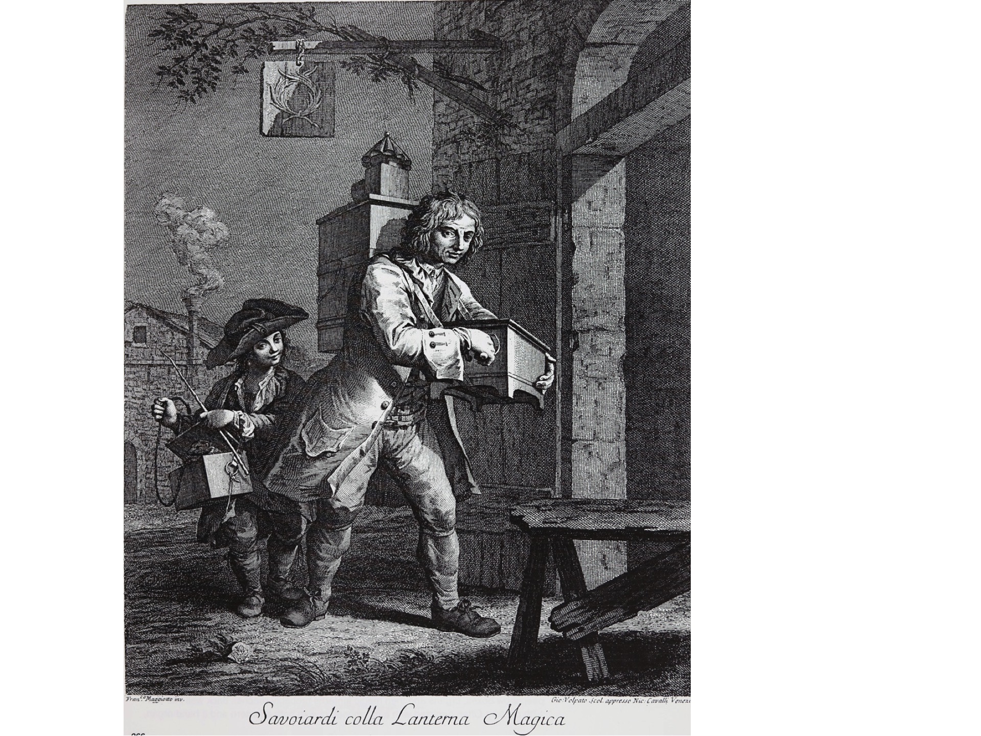
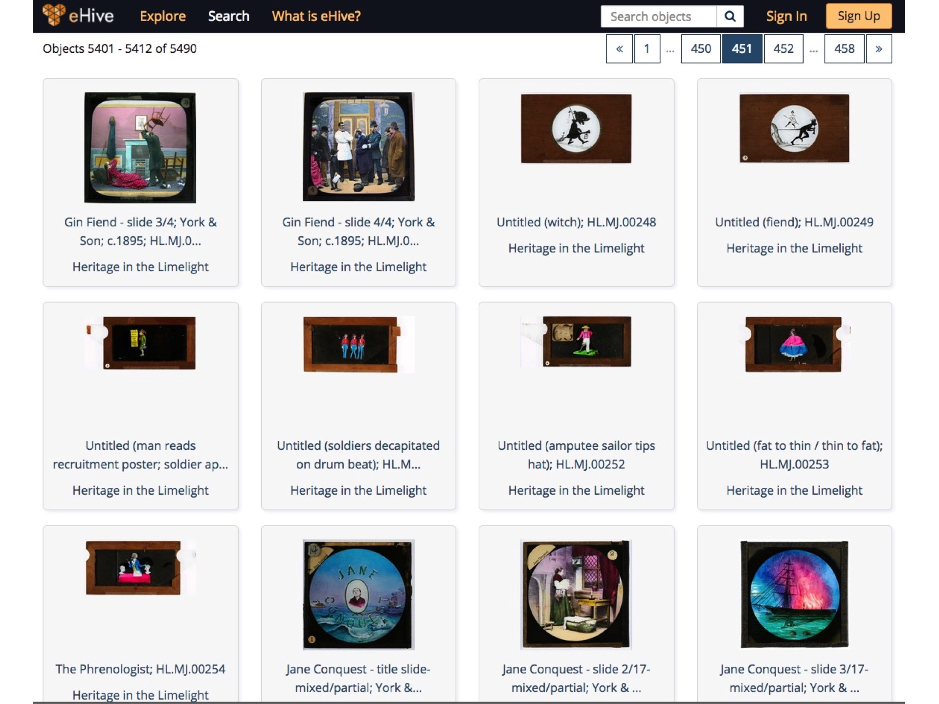
Foucault’s description could also apply to the practice of the magic lantern, which was blossoming and becoming culturally pervasive during exactly the same period. The apparatus of the magic lantern began in the Netherlands in the mid 1660s and it ends up there, on the ceiling of this seminar room. Traveling entertainers carried magic lanterns on their backs around Europe for over century before the technology became incorporated into a theatrical illusion designed for metropolitan audiences called The Phantasmagoria. Later in the nineteenth century this technology began to be industrially manufactured and marketed directly to the middle classes and the intelligentsia. Photographic magic lantern slides began to be produced after 1850 and by the end of the century audiences around the world were laughing at ingeniously animated hand painted slides, and at hand coloured photographic slides that told moral stories or illustrated sentimental songs. The ARC project I lead, Heritage in the Limelight, has already assembled a database of five and half thousand of these slides.


At this time, at the height of modernity, the strange couplet ‘magic’ and ‘lantern’ was at its most compelling, the word ‘lantern’ projected the rational illumination of knowledge, whereas the word ‘magic’ harked back to the psychological affects of deception, illusion and diabolical darkness. The strange couplet was still in use well into the twentieth century when, after bequeathing its grammar of narrative syntax and visual effects to film, it stayed on as part of the cinematic apparatus showing theatre advertisements and illustrating songs. It also entered the home, the school-room, the church hall and the university, slowly transforming into the 35mm slide and eventually the Powerpoint slide.

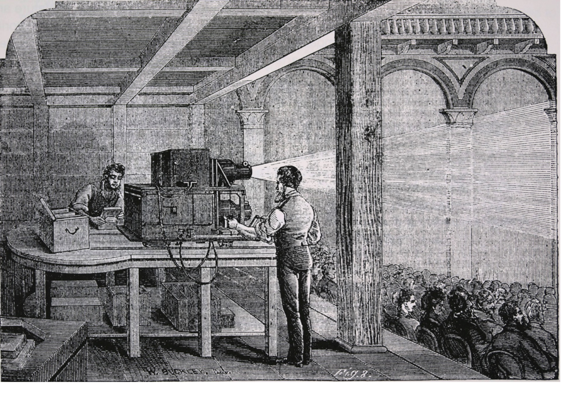


The magic lantern was an apparatus of reproduction, distribution and recombination. There was no such thing as an ‘original’ slide, they were copies of illustrations, paintings, prints or other photographs. There is no such thing as a single slide, each slide was produced as part of a set, and stored, distributed and exhibited as multimedia sequences. There are thousands of amateur slides, but millions of mass-produced ones which were retailed in shops around the world. But the consumers at the end of the production chain were also producers. Lantern slides have to be projected to be realized, and it was up to the lanternist to decide which combination the slides were projected in, and with what musical or spoken accompaniment.
The magic lantern was a ubiquitous visual presence, yet the silos of scholarship have all but ignored it. For art historians there are no genius artists to biography, no rare objects to analyse, no conceptual innovations to name, no radical styles to track. For the art market there is nothing to sell, nothing to buy, nothing to appreciate. For film historians the magic lantern is just ‘pre-cinema’, an imperfect version of ‘the movies’, waiting to be superseded. For the photo historian the glass slide disappears behind the primacy of the paper print with its physical relationship to the traditional work of art.
However, even as the traditional historical disciplines were doing their best to to ignore the magic lantern, the lantern itself was at work, secretly transforming them from within. Because of the lantern, the immediate object of art history became not the art-work itself, but the photograph of the art work. After the lantern, all of art history became merely a subcategory of photography. Disguised, but nonetheless crucial dates in the development of the discipline of art history are: 1854, when the British Museum appointed Roger Fenton as their first Official Photographer; 1884 when John Ruskin borrowed a magic lantern from a London theatre to project his watercolours at a lecture (Fawcett 453); and 1909 when the South Kensington Museum started to catalogue its fast-growing glass slide collection (Fawcett 456).


In Berlin, the Professor of Art History, Hermann Grimm, began to use the magic lantern scientifically, like a microscope in reverse, isolating and enlarging the art work so the viewer could apprehend it in its essential totality. In keeping with other scientific demonstration of the period, the lecture room became a kind of laboratory stage, or an experimental theatre. (Karlholm p208).
Grimm’s successor, Heinrich Wölfflin, elaborated on this theatre. A student recalled that Wölfflin removed himself from the lectern to the side of the audience. When a new image appeared on the screen, he would resist the temptation to speak for a while, building audience expectation within a tangible silence. Then, as if listening to the work itself, be would begin to slowly put words and sentences to the image, to converse with it, creating the impression that the art work, literally, spoke to him. (Karlholm 209-210)
Wölfflin further developed his use of the magic lantern by using two lanterns to project two images side-by-side. One projector showed the ‘key note’ throughout a sequence, while the other showed variations, details or exceptions. Other German art historians in the same period, such as Adolph Goldschmidt, were also using double projections to make it easier for students to compare two different art works, both flattened to a equivalent black and white monochrome, without having to retain one in their memory. These magic lantern lectures were thus a side-by-side comparison as well as a one-after-the-other progression. Thus, the students mesmerized in the dark beheld art history manifested not in the museum, but in their imaginations. (Nelson 430).
In 1912, at the Tenth International Congress of Art History, Aby Warburg performed his famous iconographical analysis of a renaissance fresco in a lantern-slide lecture, which he referred to as a ‘cinematographic spotlight’. (Michaud 38). Warburg’s ‘iconology of intervals’ which paid attention to the montaging of multiple images, and his discovery of what he called a ‘pathos formula’ of poses that travelled across history, geography and cultural difference, was entirely dependent on an archive of photographic reproductions, and an apparatus of both narrative and comparative conjunction, provided by the magic lantern.


Recently Georges Didi-Huberman has revived interest in Warburg, and interdisciplinary scholars like Philippe-Alain Michaud have seen Warburg’s famous Mnemosyne Atlas, produced in the late 1920s, as part of an emerging ‘cinematic mode of thought’ (Michaud 278). But they too have forgotten the power of the magic lantern to structure thought. More than just being a proto-film, Warburg’s panels were really a physical materialization of the two-lantern magic lantern lecture. The ideal space of the darkened auditorium is reproduced in the black cloth with which he covered the sixty-three panels to which he stapled his reproductions, and the transport of the lecture is reproduced in their sequential installation. Like the lectures, the pictures on the panels are both side-by-side and one-after-another, both paradigmatic and syntagmatic.
Contrary to the claims of Michaud, the media form which Warburg’s unfinished masterwork prefigured was not only the movies, but also today’s Google Image Search or Pinterest Board. So I would like to conclude with some other examples, not only from the magic lantern’s impact on the exhausted discipline of art history, but from the vernacular practice of the magic lantern itself, to make the archaeological connection between magic lantern practice and the ‘right-click’ culture of contemporary media.
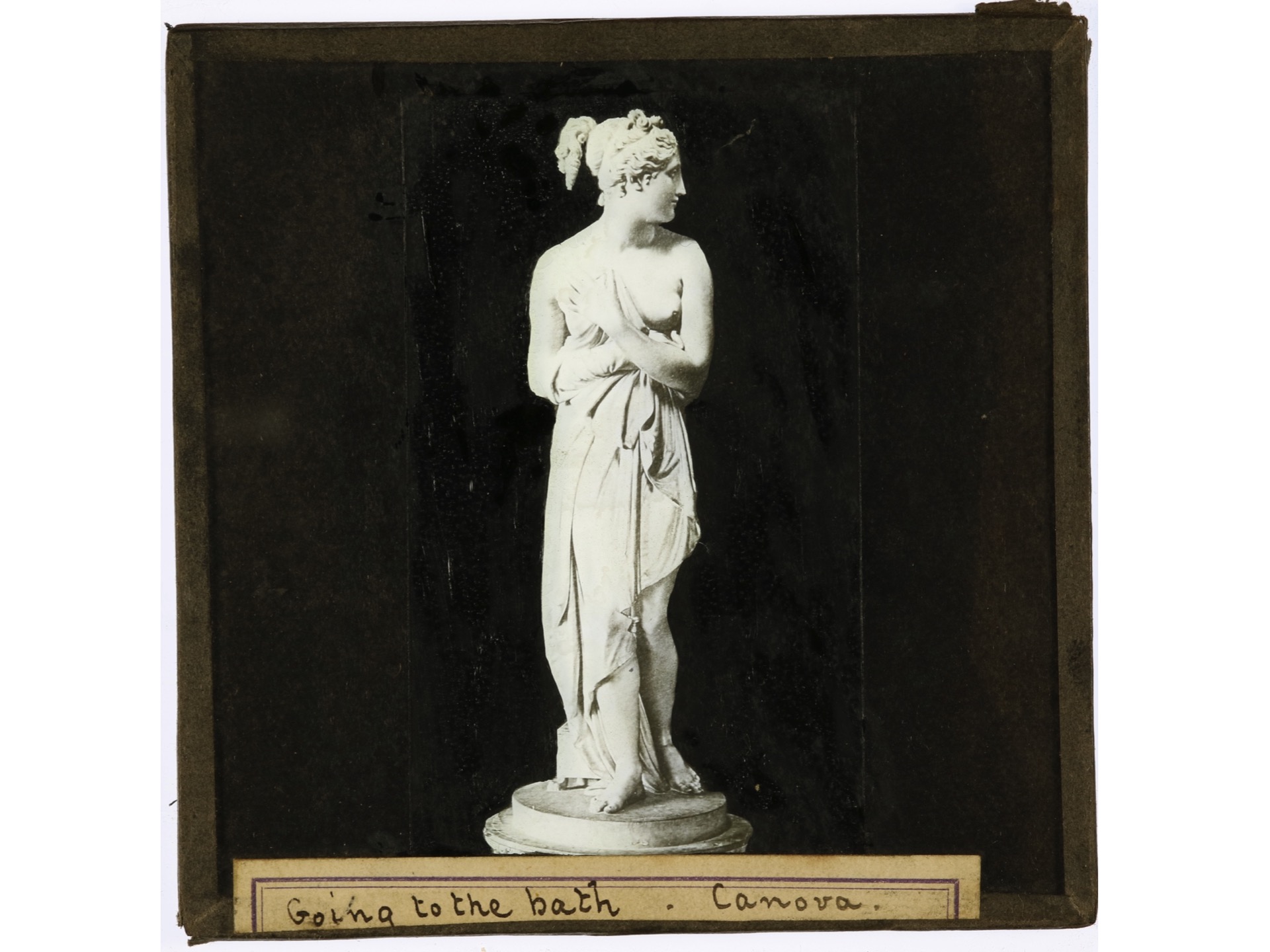
Enter the words ‘Ned Kelly’ into Google image search and you’ll be met with an array of images: nineteenth century photographs of the bearded man himself, woodcut illustrations from 1880 newspapers of Ned in his armour, images of Mick Jagger and Heath Ledger acting in their respective Kelly films, and kitsch souvenirs. If you visit the National Museum of Australia’s online catalogue and enter the same words you will return a not dissimilar grid of images — 77 Ned Kelly magic lantern slides which were purchased as a set in the early 2000s. You won’t find Mick or Heath, but you will find film stills from Australia’s first Ned Kelly film, The Story of the Kelly Gang, as well as images copied from books about Kelly.


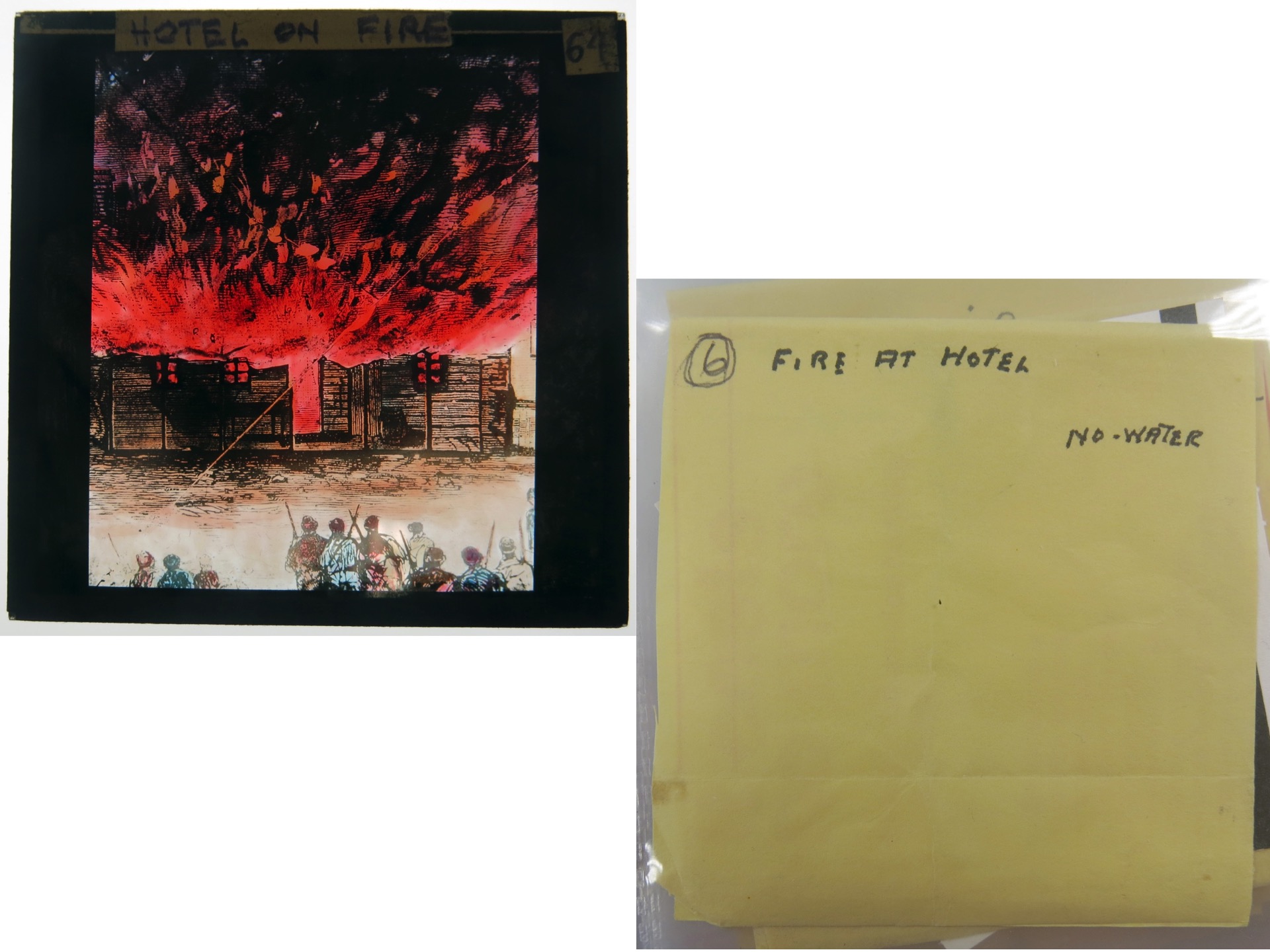
The images in the slides themselves aren’t rare, most of them were frequently reproduced as the Kelly myth grew and grew. But what is of interest is the unknown person who assembled them in the 1940s. Whoever they were, this amateur iconologist was obviously a bushranger buff preparing a show, perhaps for a public lecture at an historical society, or perhaps just for their family of friends. They have made the lantern-slides by copying the huge array of bushranger imagery already circulating through contemporary sources. Each slide has been extensively labelled and relabelled, and each has been placed into its own sleeve improvised out of old bank deposit envelopes. Perhaps our lanternist had a personal interest in Kelly’s crimes, perhaps he was a bank teller by day and a bushranger buff by night? In the spidery handwriting of an aged person captions and prompting words for a live commentary have been added to the envelopes, such as RED BLAZE FLAMES, for a slide of Glenrowan pub on fire. This slide has also been hand coloured, so the burning of the Glenrowan pub, tinted red in Australia’s first feature film, is tinted red again in this lantern slide. Other images come straight from the siege. For instance the set contains the famous image by J W Lindt of the body of Joe Byrne strung up an a door. However, this image was copied out of a book, perhaps Julian Ashton’s autobiography published in the 1941.
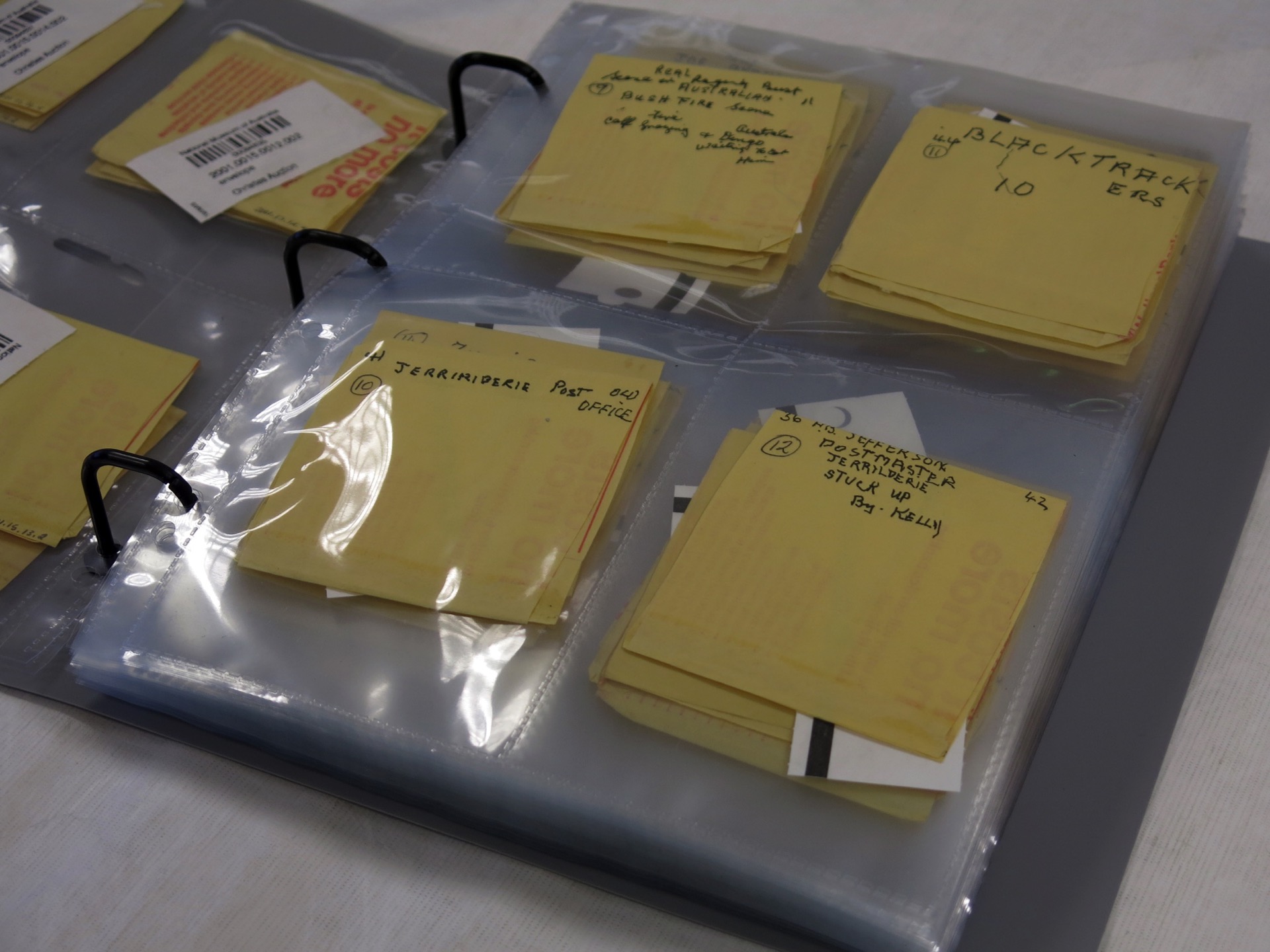


This obscure collection is significant because it prefigures today’s casual ‘right click culture’. Magic lantern slides were a way of ‘saving as’ existing images, duplicating them, reformatting them, shifting them and recontextualising them. The Museum has preserved here not just a comprehensive databank of bushranger iconography, but a complete individual practice, a new way that had been emerging for decades for everyday people to use popular images to say new things about their history.
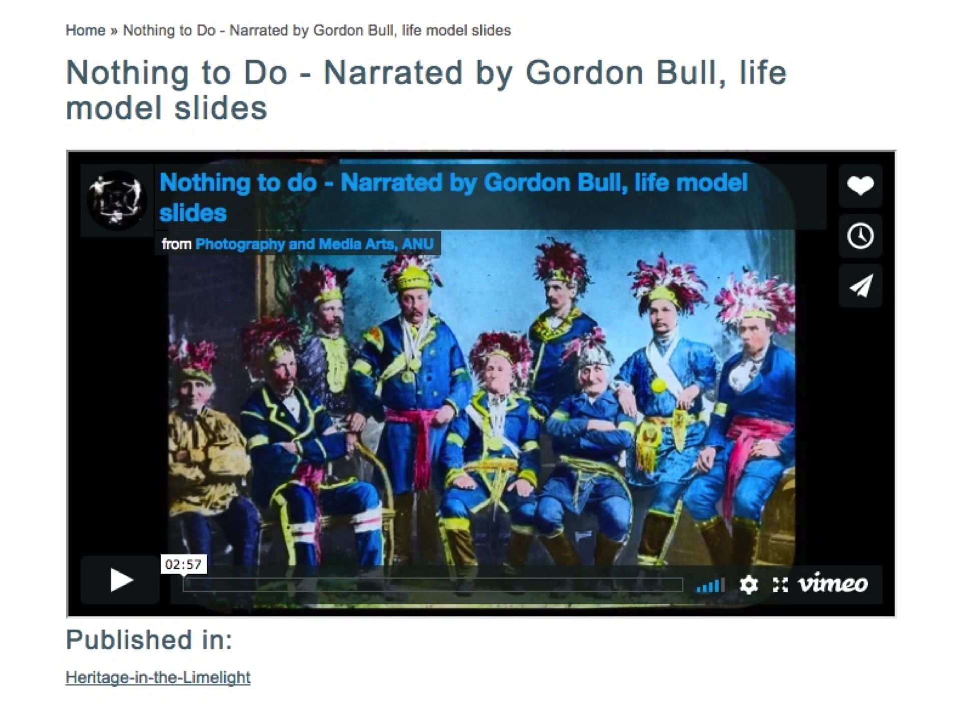
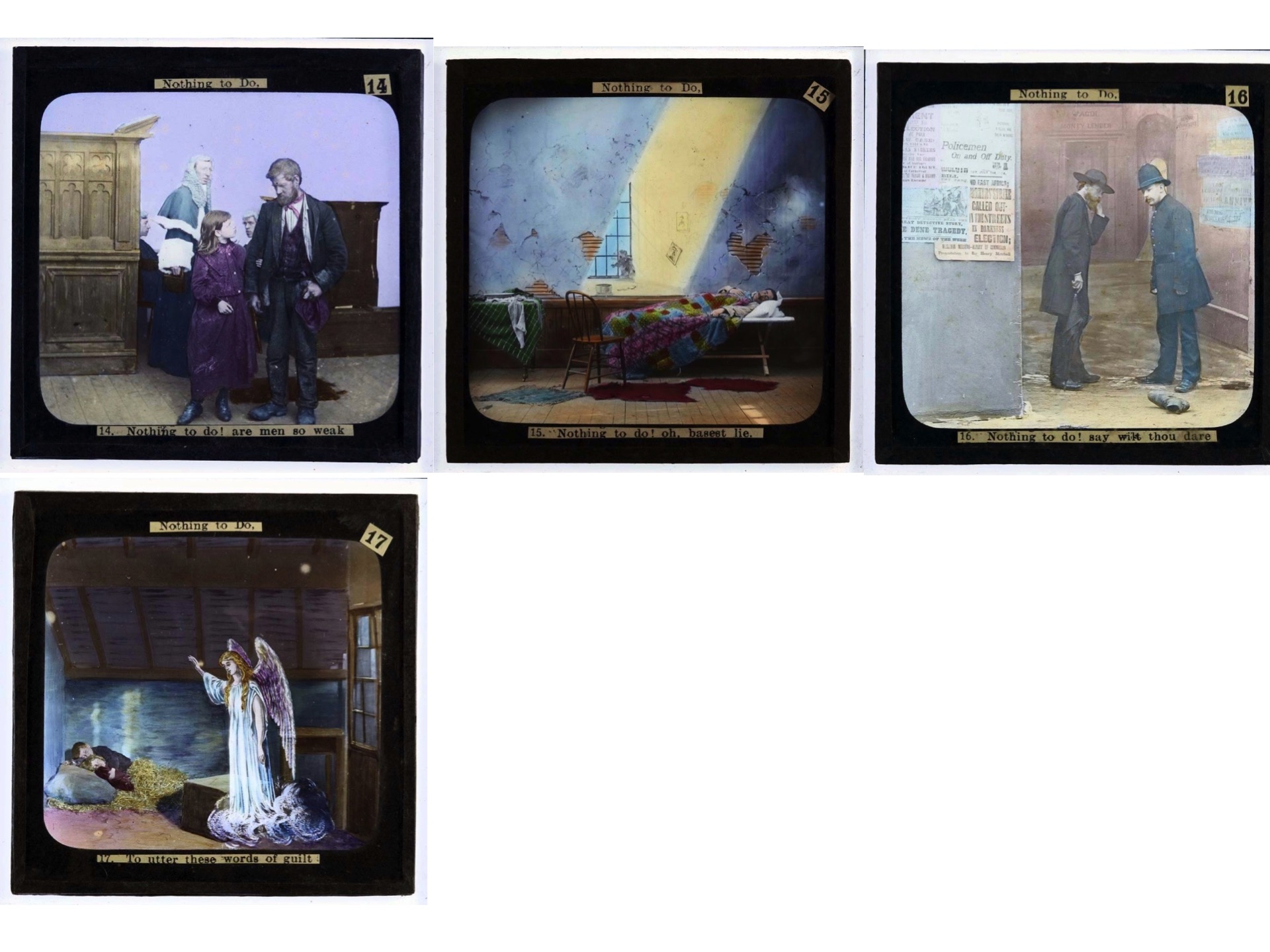
Another example is Nothing To Do, a set in the Heritage in the Limelight collection. We are pretty sure this set was assembled in Australia. The slides illustrate a poem written by the Reverend Walter John Mathams who visited Australia between 1879 and 1882, when he was a minister at the South Yarra Baptist Church. The poem warns that those who turn a blind eye to poverty, drunkenness or violence because ‘there is nothing to do’, will be condemned in the afterlife. Nothing To Do was published in Mathams’ book Bristles for Brooms, as well as various Australian newspapers after 1888. In 1943, sixty years after it was written, the socialist writer Mary Gilmore republished it yet again in her column ‘For Worker Women’ in the union newspaper The Australian Worker. This set of slides would have been assembled around the 1890s, and may have been performed in protestant churches or at union events. (Gordon Bull does an excellent performance of the poem on the Heritage in the Limelight website.) The ‘life model’ slides which make up most of the images in Nothing to Do were manufactured overseas by companies who posed models against painted backdrops, photographed them, hand coloured them, and then distributed them, as a multimedia packages along with a printed reading, throughout the Anglophone world. But this set has been bricolaged from other sets. Images that were originally made for other sentimental songs, pious poems, or melodramatic stories have been repurposed. These have been mixed with conventional travel slides to illustrate some of the poem’s more trenchant points.


How do we know that the bricoleur was Australian? Because another set from the same period, which uses the same printed labels, attempts re-territorialize a set of America ‘song slides’ for the Australian market. The song is called He Carved His Mother’s Name Upon the Tree, and the slides were made to ‘illustrate’ a live performance of the song in theatres, therefore increasing sales of the sheet music which is how musical content was distributed before the mass production of gramophone records.

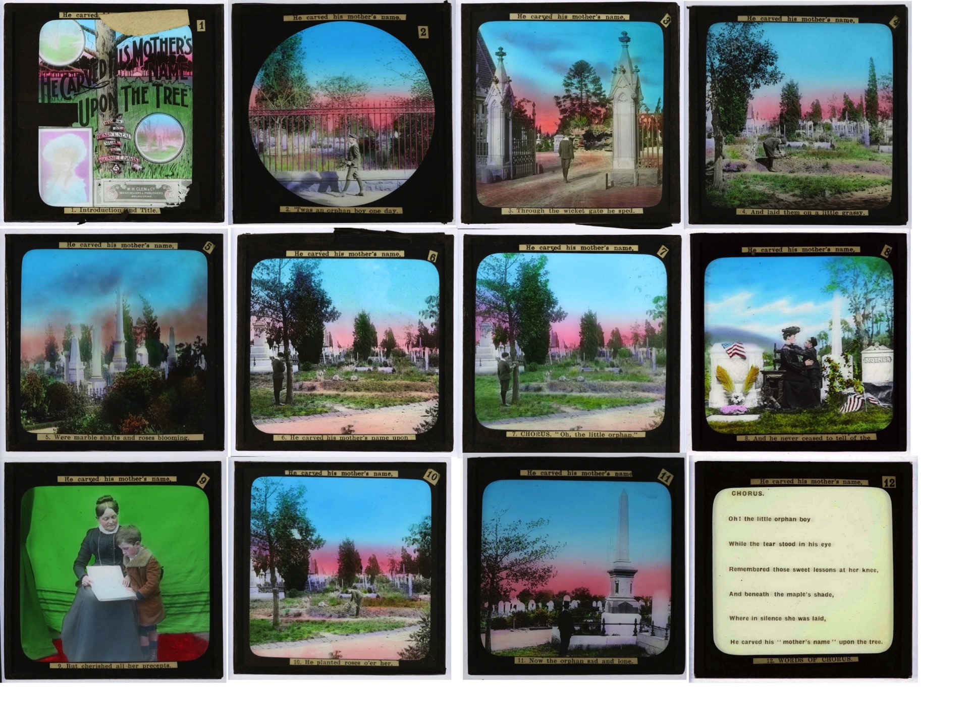
However in the set shown in Australia, tiny rectangles of black tape has been used to modify the opening slide, which is a photographic reproduction of the cover of the sheet music. The identity of the American song illustrators has been erased, and the original Tin Pan Alley music publisher has been replaced with a Melbourne sheet music retailer. In addition, tape has been used to cover the words “A sympathetic song from life” at the top edge of the slide. We see in this example physical evidence of competition between emerging global territories for technologized content, which is so much part of our contemporary media environment.


These three examples may appear minor, but they are just the tip of a very big iceberg. Once the last art historian has been strangled with the entrails of the last film historian, who has been strangled with the entrails of the last photo historian, media archaeologists can begin to look at the totality of our visual culture, including its technological substrata, and gain a richer understanding of the new reality being constituted by the ‘picture forms’ which the things in our lives are continually shedding.
Martyn Jolly
‘Developing the Picture: Wölfflin’s Performance Art’, Dan Karlholm, Photography and Culture, 2010, 3:2 207-215
‘The Slide Lecture, or the Work of Art ‘History’ in the Age of Mechanical Reproduction’, Robert S. Nelson, Critical Enquiry, vol 26, no 3 Spring 300 414-434
‘The Stereograph and the Stereoscope’, Oliver Wendell Holmes, The Atlantic Monthly 1859, June
‘Aby Warburg and the Image in Motion’, Philippe-Alain Michaud, Zone Books, New York, 2004.
‘Visual Facts and the Nineteenth Century Art Lecture, Trevor Fawcett’, Art History, Vol 6, Issue 4, pp442-460
Hito Steyerl, ‘In Defense of the Poor Image’, The Wretched of the Screen
Michel Foucault, Photogenic Painting, 1994
I was intrigued when I noticed at the National Gallery of Victoria that each landscape-oriented image in Bill Henson’s latest installation of pigment prints from digital scanned negatives had the same slightly rough edge around the black border. Was this a digital simulation of the effect you would get at the edge of a negative printed from an optical enlarger? And since each rough edge was exactly identical, as is visible even in the online selection, was this a single film-edge stock-file composited on top of the different digital scans? This automatic visual affectation simulating an optical print in a bit mapped print-space is pure Digital Pictorialism, as assuredly as overly desaturated, or overly saturated, or overly healed Photoshop images are. They are all either technologically skeuomorphic or aesthetically nostalgic. These added-on edges are beginning to make Henson’s iconography look not only familiar, but also rote.
The edge of a Henson digital pigment print

Henson print, skeuomorphic edge? (mobile phone bit out of focus)

Different Henson print, same edge
Try as I might I just can’t get myself worked up into a rage about the ‘William Eggleston Portraits’ hang at the NGV. In fact I quite liked it. The show which was shipped out to Australia from London’s portrait gallery contained two new large scale digital enlargements from scans of his 1970s negatives to entice punters into the space; and then, cue gasp, new digital prints alongside ‘vintage’ 1970s dye-transfer prints. I agree with one colleague who pointed out that it’s a shame the opportunity was missed to show Australia’s own Eggleston dye-transfer portraits, including the super-iconic ‘Huntsville Alabama’ c1969-70, only in this show as a new digital print, which is sitting in all its dye-transfer glory in a solander box up in Canberra. And I could immediately see for myself that the London portrait gallery’s addition of gossipy back stories to some, but not all, of the prints seriously corrupted the totality of Eggleston’s ‘democratic’ vision. But, standing back from the walls a few metres, the mixture of print technologies visually ‘scanned’ together coherently for me, and when I got up close I loved the warm toothsomeness of the dye transfers, of course, but also thought the dry stipple of the new digital prints was pretty good too in its own way. And why can’t Eggleston agree to make large scale enlargements for the kids who, brought up on giant face-mounted acrylic museum photography, are used to big prints? He’s still alive, he can make his own decisions. Once lured inside, the kids found themselves treated to a selection of his small black and white ‘vintage’ work prints from the early sixties which I saw them eagerly poring over. This fetishisation of the vintage print, vocalised by the tuts directed towards this hang, can’t sustain itself for much longer. Before all of their other elaborations, most photographs (OK, not daguerreotypes and not iPhones) are in two parts: negative/print, capture/display. The vintage print may be the ordinary gallery-goer’s safest path to directly accessing the artist’s vision at the time the work was conceived, no question, but photographers, particularly photographers like Eggleston, are shooters as well as printers. Negative and print are separate objects, separated even ‘about the time the negative was made’ by separate technologies which activated different sets of substrate, pigment, halide, dye, coupler and bleach in different ways. They were divergent even in this mythical and temporally undefinable prelapsarian ‘vintage’ time, and they haven’t got more divergent since, only the technological nature of their divergence has changed. The supply/demand market-based logic of editioning photographs is alien to the fundamental nature of photography, it was imported into photography from manual printmaking conventions by gallerists trying to make a buck more recently than you realise. (Dupain never editioned ‘Sunbaker’ for example, he just wearily put the neg in the enlarger one more time whenever he was asked.) Also fundamentally alien to photography is setting up the print as the capital of all photographic aesthetics. Where would you rather look to find an old street photographer’s original intention, at a faded and severely colour-shifted type-c print made in some dodgy darkroom, or at a pigment print made from a fresh scan of the original negative? But which will get the higher price in a gallery? Those of us who aren’t in the print fetishists club are told we lack discrimination. Quite the opposite. We are quite capable of discriminating the nuances of different camera AND print technologies, and understanding them in terms of the technological history of photography, which includes deterioration of negative and print in different ways at different rates. But unfortunately our task isn’t helped by the lazy labels in the Eggleston show where the different exposure and printing dates are deliberately fudged, and viewers are encouraged to not discriminate. (Thanks to Geoff, Justine, Danica, Jane, Bronwyn and Isobel!)
An interview I did with Katrina Sluis from the Digital Programme of the Photographers Gallery, London, is now up at Daniel Palmer and myself’s Photocurating site. Check it out. There’s one there Daniel did with Ian North too. While you’re there have a look at our Timeline and see if you can spot anything we’ve left out. Then let us know. We still need more installation shots.

‘Snapheal’ ad
‘Fatal Algorithms’
I’m saddened by the prospect that the fatal algorithms of this app might actually being used by some hapless people on their snapshots. Photographic contingency, the precious flame worshiped by generations of photographic theorists, is extinguished by the cold blast of these automatic operations. Time, memory, and place are all sucked into their frigid black hole. In the future the image will no longer prick or prod us with the unexpected, it must lie supine. Under the tyranny of these ‘healing’ tools photography no longer records but projects pale antiseptic fantasies. Yes, fantasy has always been a part of the snapshot, but at least they were constructive fictions, what is proposed here is solipsistic fantasy through erasure and exclusion.
In the last week Facebook has banned the aged breasts in the background a photograph from 1999 posted by Ella Dreyfus, and the indigenous breasts from a traditional Aboriginal ceremony posted by Celeste Liddle. Both bans are of course absurd and offensive. But Facebook’s explanations are revealing. On the one hand it claims that ‘diversity is central to Facebook’s mission of creating a more open and connected world’, but on the other hand, it explains: ‘The reason we restrict the display of nudity is because some audiences within our global community may be sensitive to this type of content – particularly because of cultural background or age. In order to treat people fairly and respond to reports quickly, it is essential that we have policies in place that our global teams can apply uniformly and easily when reviewing content. As a result, our policies can sometimes be more blunt than we would like, and restrict content shared for legitimate purposes.’ Facebook’s mission is actually to circulate messages and images to as many consumers as possible, as rapidly as possible, so they can view ads. It may fantasise that it is something like a Habermasian public sphere, but on Facebook discursive relations are always subsumed in market relations. The connected world is a global market. (Plus, as Clementine Ford points out, Facebook HQ is still permeated by frat boy culture). Unfortunately, because of the ruthless efficiency of its image distribution model, for many artists and activists it remains indispensable.

Ella Dreyfus, Age and Consent, 1999

Chris Graham, Aboriginal Women at a Northern Territory public ceremony, 2016
From the ANU Reporter Vol. 46 No. 2, May 2015
In the world Trending #2
There have been two different phases in the relatively short history of digital photography.
First was the apocalyptic phase, when there were dire warnings of ‘the end of photography’. The coming ‘revolution’, it was claimed, would fundamentally reconfigure the photographic ‘eye’.
We would be cast adrift from the firm shores of analogue photography, where chemical emulsion reliably reacted to the light reflected from real-world scenes, and left to float on a digital sea where pictures, now just data, could be changed at will.
Like many apocalypses, this one didn’t come. Although iconic names such as Kodak were swept away into history, the practice of photography itself went from strength to strength.
Cameras got cheaper and smaller and people took more and more photos to post on social media. Far from being bankrupted, the newly ubiquitous medium gained more impact than ever.
What those Chicken Littles didn’t realise is that photography is much more than just a technology, it is a social practice, a personal habit, a psychological need, an accumulated history of looking and, increasingly, a global network of exchange.
Photographic truth is supported by social protocols, and it is the multiple micro-recalibrations of these that we are currently experiencing in the second phase of digital photography. News organisations still protect direct photon to pixel mapping.
When Adnan Hajj, a hapless stringer for Reuters, was caught out by sharp-eyed bloggers using Photoshop’s clone tool to increase the amount of smoke rising from Beirut after a 2006 Israel bombing raid, he was summarily dropped. All 920 of his images were immediately removed from the Reuters site and a picture editor was sacked.
However, while minor excisions and additions to the image are strictly policed, enhancements or modifications to the connotational ‘feel’ of the reportage image as a whole are still allowed by press photography protocols.
In 2010, Stepan Rudik was stripped of his World Press Photo award. He had radically cropped thephotograph he submitted, Street Fighting, Kiev, Ukraine, and applied a heavy Photoshop filter to it. But that wasn’t why he was stripped of the award, it was because he had digitally removed a tiny pinch of pixels representing the intrusive foot of an irrelevant figure in the background of the image.
This year, 20 per cent of World Press Photo entries were disqualified for similar digital cutting and pasting and controversies like these, big and small, continue to erupt across the Internet.
But if we take a sideways step into celebrity photography, we find not only a tolerance for digital enhancement, but an expectation of it.
We are all now so completely habituated to seeing the flawless, poreless, skin of our celebrities stretched over their cheekbones that we barely give the routine post-production enhancement of the glossy images we consume a second thought. Indeed we now expect it as a kind of fantasy ‘truth’.
When 224 un-retouched photographs from a Beyoncé advertising shoot were released on a fan site earlier this year, before the texture of her tiny acne scars, moles and wrinkles had been digitally smoothed away, her fans “freaked out”, and were left “shocked and lost”.
The site was forced to remove the photographs of what they maintained was just Beyoncé as a “naturally beautiful” “regular woman” because “some of the things we have seen posted were just horrible, and we don’t want any part of it”.
But, before we laugh too quickly at the betrayal Beyoncé’s deluded fans felt, we must realise that reportage photos are also routinely undergoing similar makeovers.
In 2013, another controversy engulfed the World Press Photo Award when winner Paul Hansen’s Gaza Burial was accused of digital manipulation. It was eventually revealed that it was the product of the superimposition of three separately modulated versions of the one file, which gave the final digital composite a cinematic feel as though the director of photography on a big Hollywood movie had lit it with movie lights. Nonetheless it retained the prize because, although it had been enhanced, no pixels had been removed or added.
The meaning of the words ‘photographic manipulation’ is shifting before our eyes and growing in complexity. Today’s digital cameras don’t take pictures, they record data.
In this new imaging logic, the journey from scene to image is a continuity where image manipulation can feedback into a scene’s ‘truth’.
Add to this the exponential proliferation of images online, the acceleration of their transmission, and their accumulation into vast data-bases and we are set for yet more fascinating recalibrations in photographic truth.
